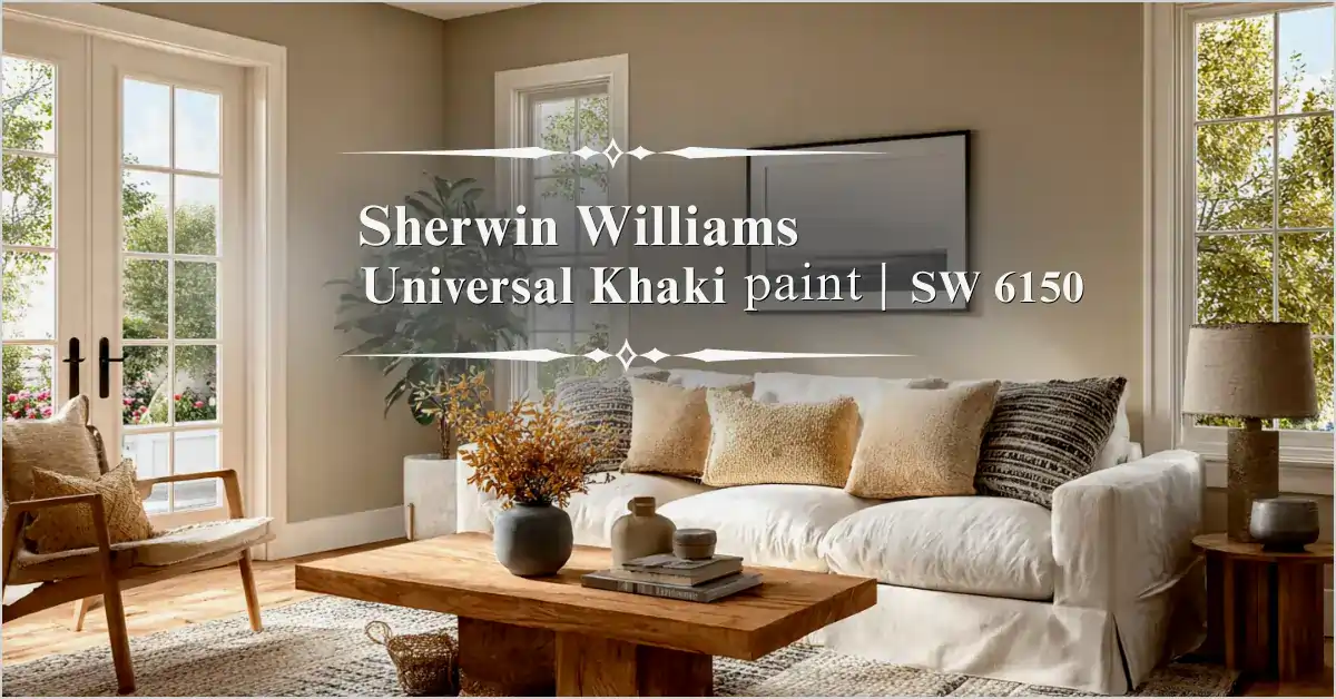
Sherwin Williams Universal Khaki Paint: The Warm, Grounded 2026 Color of the Year That Brings Timeless Comfort to Your Home
There are paint colors that wow you for a season, and then there are colors that settle into your heart and make a house feel like home. This paint color is one of those: Sherwin-Williams Universal Khaki, SW 6150 — Sherwin-Williams Color of the Year 2026. This mid-tone earthy neutral is winning hearts not because it’s trendy, but because it feels right — livable, grounding, and adaptable to real life.”
I’ve spent some serious time with this color as I’ve thumbed through homeowner stories, designer reviews, and official descriptions, imagining (and hearing about) how it transforms all sorts of spaces. In the end, it’s all about the beautiful balance: warm enough to envelop a room in coziness, deep enough to provide quiet drama, neutral enough to have your back while letting your furniture, art, and personality take center stage.
If you’ve been sifting your way through the paint chips and growing weary from one too many warm beiges or icy grays, Sherwin Williams Universal Khaki paint color may be just the fresh take you need. In this slow walk guideline, I will detail the color’s undertones and how it changes naturally in different lights, how to use it on walls, cabinets and exteriors and more, khaki paint color schemes, the real pros and cons by real people that have used it, practical painting tips, and why this color can feel fresh for years.
Table of Contents
Understanding Sherwin-Williams Universal Khaki SW 6150 at Its Core
Universal Khaki is a soft mid-tone tan between beige and taupe. Think of the cosy colour of a favourite pair of khaki pants baked in the sun, or the colour of dried grasses in a late summer field. It’s not a stark modern grey, it’s not a pink-beige, and it’s not a bright sandy colour; it’s an earthy, friendly neutral.
Sherwin-Williams describes it as “earthy and timeless, this mid-tone tan is a reliable choice for common areas.” Go with crisp whites for classic cleanliness, or get deliciously sumptuous and surround it with more saturated colors. Its LRV is about 40-41, so it’s a true medium-depth neutral; it reflects enough light to avoid feeling closed in, but its depth of color gives it a cozy dimension that pushes it into the “softer” kind of beige and away from the brighter, flatter, chalky look of lighter beiges that are prone to showing wall imperfections.
The undertones are very slight, but there’s a subtle yellow warmth at the very base, sometimes with a hint of a green or greige that can reveal itself with the materials surrounding your home and the light of the home itself. In rooms with an abundance of southern sun, you may find moments where the yellow notes take over and warm the walls with a sunny cast. In northern exposures, particularly with evening artificial light, it can sometimes read a soft green-tan that introduces an organic groundedness that helps many feel soothed and spa-like.
A major part of the appeal of Universal Khaki paint is that it is not a colour that clamours for attention. It simply looks good paired with warm woods, natural textiles or bolder accents.
The Inspiration and Story Behind Universal Khaki as the 2026 Color of the Year
Choosing a Color of the Year isn’t something the color experts at Sherwin-Williams take lightly. They study global trends and cultural shifts, material preferences, and—most critically—what people yearn for in their living spaces. For 2026, they’ve landed on “Tailored & Timeless,” embodied beautifully by Universal Khaki Sherwin Williams SW 6150.
With a world that feels chaotic and busy daily, many homeowners are clamoring for the simple, the comfortable and the silent strength. This hue embodies the satisfying beauty of the essentials of life: a nature-inspired warmth, a soft elegance and an almost unfinished quality that begs for your personal touches.
Described as having a slightly yellow undertone that ushers in modern comfort but feels thoroughly livable, Sherwin Williams Universal Khaki paint lasts years, but not like many other past Colors of the Year, which made a splash, then splashed out of sight. Universal Khaki feels made for joy in everyday living; the neutral that grows with your family, your style changes and your needs unfold.
Our designers say it’s a “foundational” neutral upon which any number of aesthetics can lean, from modern to moderate, from cozy traditional to coastal calm and rustic luxe. It’s timeless: it feels like wood, stone, linen, and wool, warm spaces that feel intentional vs. trendy. If you’re looking for a colour that’s going to stand the test of time, this one has strength.
How Universal Khaki Performs in Real Lighting and Different Home Conditions
No paint color is ever the same in every home, and that’s particularly true of a mid-tone neutral like this. The 40 LRV means it behaves differently based on your windows, time of day, and what’s happening seasonally.
In bright, south-facing rooms, it can glow beautifully soft and invitingly warm as though the sun is always shining. In east- or west-facing rooms, it can be fresher and lighter in the morning, and richer and cozier as the day goes on. In north-facing or darker rooms, it can take on a muted earthy quality thanks to its subtle green shift. Some can find it beautiful and serene, while others find it to be a touch “muddy” if it isn’t well embraced.
Homeowners who have tried it for a good while say it has beautiful depth by the evening lamplight; what is merely tan by day is quite enfolding and cossetting after the sun goes down. It is lovely in a living room, a boudoir, or in bedrooms, for one likes to sink into some warmth after dark.
Real User Observations: It adds real life and depth to a space in a way that lighter beiges may wash out. That “the medium depth helps it stand up against strong architecture or bold furnishings”. It loves natural textures—think oak floors, rattan chairs, wool rugs, and stone countertops—which echo its earthy roots and make the color feel harmonious.
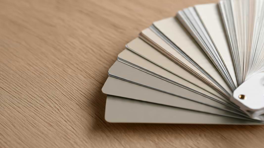
Of course, you should test. Many people swear by large peel-and-stick samples because they use actual paint and can be moved around walls, near furniture, and in different lights over several days. What looks ideal on a tiny chip can throw a curveball when it’s on a real wall.
Detailed Room-by-Room Ideas for Using Universal Khaki Indoors
This color’s true strength shows when you start applying it thoughtfully throughout your home.
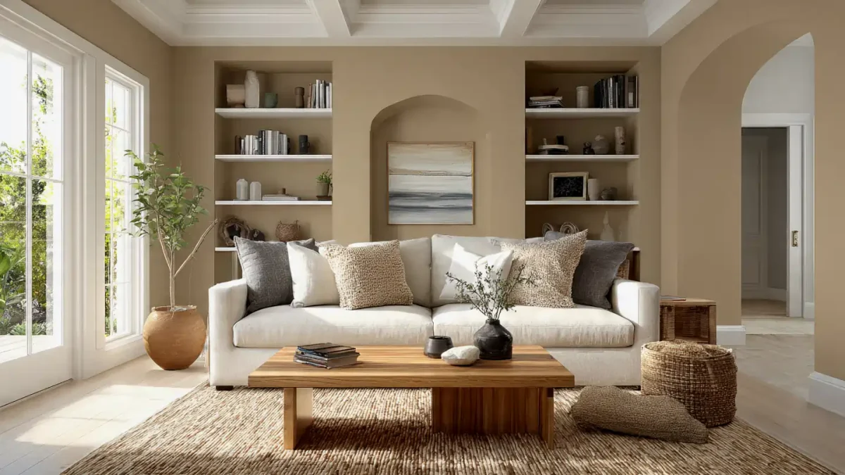
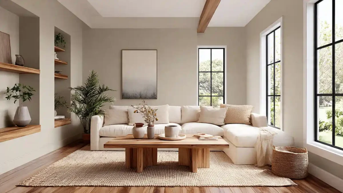
- Living Rooms and Family Gathering Spaces Like a hug from Grandma, a living room painted in Sherwin Williams Universal Khaki paint always makes us think of home after a hard day at work. It makes for a soft, sophisticated cocoon that enables sofas, rugs, and art to shine. Creamy contrasts in Alabaster SW 7008 or Dover White SW 6385 add a crisp accent. Layer in an assortment of textures—linens for slipcovers, jute rugs, warm woods and a mix of brass or matte black accent hardware. Many people add depth with navy pillows, sage throws, or a leather ottoman. Imagine a cozy movie night with friends.
- Bedrooms for Peaceful, Restful Retreats In primary or guest bedrooms, the color’s warm, earthy quality offers a warm embrace. Embrace is cozy but not dark or heavy. Homeowners frequently paint all four walls and pair with soft blush pinks, soft greens or fresh creams for bedding. Open-grain natural wood nightstands add to the sweetness, and linen curtains billow. The green undertone can lend a light, organic spa vibe that switches you off at the end of the day. Some people even use it as an accent wall behind the bed for better interest while keeping the remainder walls light.
- Kitchens That Invite Connection and Everyday Joy Universal Khaki Sherwin Williams works beautifully in the kitchen—on walls or lower cabinets—as it makes stainless steel feel warm and cozy, and not clinical. Pair it with light wood or white uppers, stone counters with warm veining, and lots of fresh plants or open shelving. Use it in a dining room that opens to the kitchen to elevate casual meals, bringing out the richness of a dark wood table or adding a woven texture to seat or light fixtures. If using it in cabinets, check that your backsplash and counters harmonize with the earthy tone.
- Bathrooms and Powder Rooms for Grounded Elegance Tiny spaces need help with a touch of this depth. Use it in your powder room with a white vanity, mixed brass or matte black fixtures and a little greenery, and you’ve got the chicest boutique hotel finish. It’s still quiet and fresh in a full bathroom if you put Sherwin Williams Universal Khaki paint on the walls and keep everything white (or tiled!) elsewhere. However, the color on the walls grounds these spaces so they don’t feel cold, but organic and intentional.
- Home Offices, Entryways, and Hallways “The neutral” makes for a refreshing background to the home office, reducing distractions so you can clear your head for the day ahead. A front door painted in Universal Khaki welcomes guests with subtle kindness and sets a considerate tone for the rest of the house. Change of floor plan in the form of a pass-through or staircase? Let it connect the rooms in this lovely way.
- Creative Applications: Color Drenching, Accents, and Built-Ins Want to ramp up your adventurous side? Try color drenching—painting walls, trim and doors in the same color, from the walls to the trim or the doors, even the ceiling, for a modern, enveloping look. Or, apply to built-in bookshelves, wainscoting, interior doors, or fireplace mantels where you want to add an architectural element without committing to every surface. Some homeowners paint their trim and millwork, and leave the walls an off-white in a lighter tint of whites for subtle contrast and depth.
Sherwin-Williams Universal Khaki Exterior Paint: Creating Welcoming Curb Appeal
This hue isn’t just for inside. Sherwin Williams Universal Khaki exterior paint provides admirable depth that doesn’t fade to blah in the sun, and the unfettered mid-tone depth acts as a lovely counterpoint to nature, brick and stone. It can also look gorgeous against stucco and wood siding.
Popular exterior pairings include:
- Siding in Universal Khaki with white trim. “This gives it a classic look, but it can also be pretty timeless with warmer creams,” the experts say. Then “add dark shutters and you have a very classic, timeless look.”
- Pair it with darker roof shingles and natural wood beams for the modern farmhouse or craftsman vibe.
- Using it on stucco homes where the earthy tone connects the house to the landscape.
It keeps its warmth and richness in sunny climates. In shadier spots, like facing north or where the sun is intense, the depth prevents it from looking washed out, as some lighter beiges can look chalky. Homeowners reported that it created that sought-after “it belongs here” feeling, meaning that their home looked established. Choose durable exterior formulas suitable for your climate, and have them applied.
Building Beautiful, Layered Color Schemes Around Universal Khaki
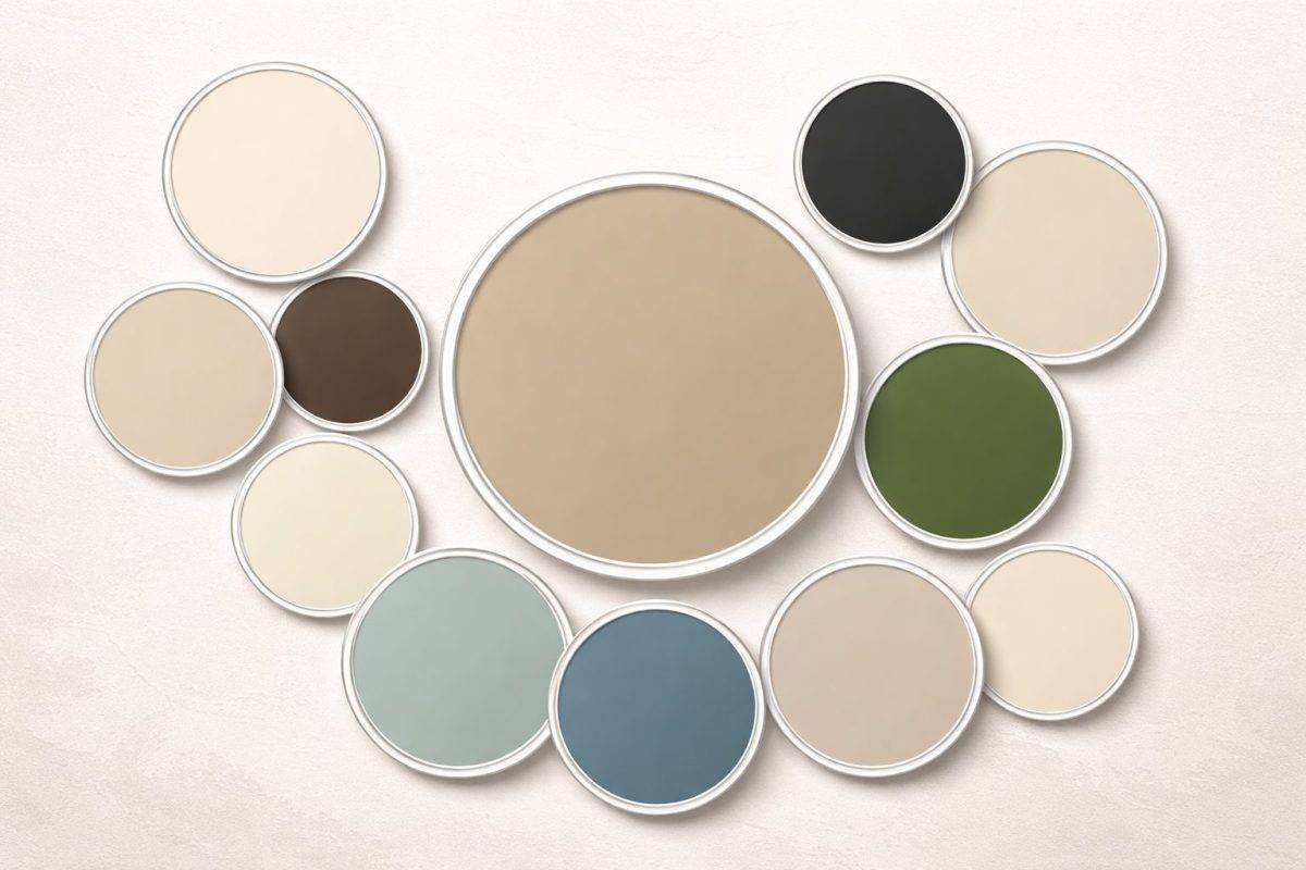
The real thrill is in how beautifully this color layers with others. Sherwin-Williams has some official coordinating suggestions, but the fun starts with Panda White SW 6147, Wool Skein SW 6148, and Mediterranean SW 7617. However, there’s so much more out there to discover.
Foundational Warm Neutrals For trim, ceilings, and cabinetry, stick to warm or balanced whites: Alabaster SW 7008 for a classic, just off of soft and creamy Greek Villa SW 7551 for understated warmth, Dover White SW 6385 for a balanced, slightly richer off-white. Negate very cool, blue-tinged whites that can cause the green undertones to intensify startlingly.
Earthy & Nature Inspired Accents Muted sages, olives, or deeper greens Grays that read warm or taupes Deep browns or terracotta Navy blues for dramatic contrast (reviews rave about it with Cyberspace SW 7076)
Bold Pops & Balances Blush pinks or soft corals for femininity Mustard yellows or golds that echo the warmth Deep burgundies or charcoals for drama
Tonal and Monochromatic Palettes Create serene, luxe facades by layering light khakis like Relaxed Khaki SW 6149 and Universal Khaki with rich taupes and warm browns for grounded serenity that reads luxe and feels very 2026.
The latter combination is a favorite I keep seeing in real homes and designer projects: Comforting and timeless, Universal Khaki Sherwin Williams on walls with Alabaster trim, warm oak floors and linens. Modern polish, layers of Sherwin Williams Universal Khaki paint with navy, brass, and leather touches. Deep green velvet sofas or pillows paired with Universal Khaki for luxurious tonal contrast. Sage greens and cream for a spa-like, tranquil feel. Light exterior siding in Universal Khaki and white trim with black or navy accents for a polished look.
Honest Reviews, Pros, Cons, and Lessons from Real Homes
Overall, the feedback for Sherwin Williams Universal Khaki paint has been quite good, with people calling it “grounded,” “approachable,” and “just warm enough to feel welcoming without heaviness.” People appreciate the depth it carries compared to lighter neutrals, and the way it translates across multiple surfaces.
Pros: good for walls, cabinets, trim, built-ins, and exteriors, holds its richness in different light and doesn’t wash out too easy plays so nicely with natural materials, current-feeling but also classic/long-lasting.
A few cons or watch-outs: The green-yellow undertones can feel stronger in cooler light (or very cool finishes), so testing is critical. Its medium depth can read heavy in smaller or darker spaces; whole home painting definitely gives the caveat that many prefer to use it in a single room, or as an accent. Not everyone loves the “muddy” or earthy cast in certain conditions—pairing with warm whites helps.
Designer/homeowner tips that come up repeatedly: Sample thoroughly with peel-and-stick options and observe over multiple days. Use in well-lit rooms to let the color breathe. For kitchens or baths, match countertops and backsplashes to the earthy tone. On exteriors, it adds depth without the (potential) maintenance issues of lighter versions. Keep in mind the application of contrast—a khaki trim against lighter walls will lend more character and interest to the space.
Helpful Hints: Where to Acquire Samples, What Sheen to Choose, Painting Tips and Budgeting
Start with the best samples. Peel-and-stick options are worth it because they convey the truest tone and sheen and how the paint interacts with your actual walls.
Worst Room Sheen recommendations: Generally Eggshell or satin for interior walls (for a soft glow plus good cleanability), Flat for ceilings to hide imperfections, Semi-gloss or satin for trim, doors, cabinets, etc. The exterior-specific formulas are all available in an appropriate sheen for weather resistance.
Best Room Painting tips from those who’ve actually done it. Prep and prime the surface satisfactorily (especially if your last paint job was a dark color); two complete coats are necessary to gain a rich uniformity of finish. Working in natural light helps, as does taking a turn away from your tall ladder to note points you have missed. Mid-tone colors like this are somewhat forgiving of minor flaws compared to bright whites, but good technique still matters.
Budget-wise, look out for Sherwin-Williams promotion days (these tend to come around frequently!), which usually include discounts on paint gallons and sample tins. Don’t forget to factor in a coat of primer if you need it, and for big (or outside) projects, we recommend budgeting for the help of a painting professional—because nothing beats a professional finish!
Long-Term Living with Universal Khaki: Does It Stand the Test of Time?
After all the details, the big question is whether it’s still going to delight you months or years down the line. From what I hear from homeowners and designers, Universal Khaki has great potential for longevity because it’s not too trendy—it’s rooted in nature/simplicity. It relaxes with you—you can add bolder art one year, more subtle textiles the next—and the walls still “work.” Families find it makes a soothing background for busy lives, and design lovers can enjoy layering texture and accent.
If your space is composed of warmer finishes and has decent natural light, you’ll probably adore living with it! In cooler or darker spaces, smart lighting and material decisions will help.
Sherwin Williams Universal Khaki paint is not about boldness—it’s about comfort that creeps up on you, beautiful spaces that settle under your skin and quietly feel like home. As their 2026 Colour of the Year, it asks us to find strength in simplicity and delight in the ordinary.
Whether you’re refreshing a single accent wall, updating kitchen cabinets, painting a whole living room or giving your home’s exterior a fresh, grounded look, this earthy neutral has the power to completely shift the way your space feels—while embracing warmth, nature and timeless design without feeling boring.
The best next step? Order some samples, fit them about the rooms, and observe the light interacting with them at various times of day. Live with them a spell. Many who do end up saying the same thing: it just feels right—cozy, welcoming, unexpectedly enlivening with its steadiness.
How about Universal Khaki Sherwin Williams? Have you sampled it, or are you considering it for your walls, cabinets, exteriors or something else? I would love to hear what you think of this gorgeous 2026 shade! Cheers to finding colors that help make every day a little more beautiful!
Read More Blogs
From Black Frames to Milky Way Magic: 15 Real Tips for Stunning Milky Way Shots
How to Make an HDRI: The Complete Step-by-Step Guide to Creating Stunning HDRI Maps and Environments