12 Photography Websites Worth Copying (Layouts, Headlines, and Contact Pages)
I’ll tell you the truth up front. My first photography website was embarrassing.
It was 2014. I’d shot three weddings for friends, I was riding that high, and I bought the fanciest template I could find. Black background, tiny grey text, a music player that auto-played some acoustic guitar I thought felt “cinematic.” I put 214 photos from one wedding in a single gallery because I couldn’t choose. My contact page asked for name, email, phone, wedding date, venue, guest count, how you found me, budget range, and “tell me your love story.”
My mom called me. She said, “honey, I love you, but I can’t figure out how to email you.”
That was the moment I realized a good photography website isn’t about showing everything you can do. It’s about making it easy for the right person to say yes.
Since then I’ve rebuilt mine maybe seven times. I’ve also become that person who screenshots other photographer websites at 11pm. Not to copy the colors. To figure out why they work. Why I stayed. Why I clicked contact.
These twelve are the ones I keep going back to. Some are huge teaching sites. Some are quiet portfolios with twelve images total. All of them taught me something I still use every time I update my own site.
Pull them up, make some coffee, and take notes like you’re in class. Steal the decisions, not the design.
Table of Contents
The Real Reason Most Photography Websites Fail to Convert
We think more is more. More photos, more pages, more words about our “approach.”
Clients don’t want more. They want clarity.
They want to know in three seconds: do you shoot what I need, do I like how it looks, do I trust you, and how do I reach you. That’s it.
The best photography websites answer those four questions fast, then get out of the way. The rest is just decoration we add because we’re nervous.
I learned this after watching a friend try to hire a photographer. She opened three sites on her phone while waiting for pasta water to boil. She closed two because she couldn’t find prices and the galleries took forever to load. She booked the third because the homepage had six photos, a short headline that sounded human, and a button that said “check dates.” That’s it.
So as you look at these twelve, watch for what they removed. That’s usually the smart part.
How I study a site without falling into a rabbit hole
I do this on my phone first, because that’s how most people will find you.
The three second test
Open it. Don’t scroll. Do you know what they shoot. Weddings, families, brands, landscapes. If you don’t know, the homepage is failing.
The thumb test
Where does your thumb want to tap. Is there a big clear button. View work, see a full wedding, check availability. If you have to hunt, you lose.
The read aloud test
Read the first headline out loud. Does it sound like a person you’d want to have coffee with. “I photograph rainy elopements on the Oregon coast and I’ll bring extra umbrellas” beats “documenting authentic love stories with a timeless editorial approach” every time.
The data test
Turn off wifi. Load it on cell data. Does the first photo show up sharp in under two seconds. If it stutters, people leave. Speed is kindness.
The trust test
Do you see a real face, a real name, a real town, a real client quote within one scroll. Not a five star graphic. A sentence from a human.
I write one line for each test. After twelve sites I have sixty lines. That’s my blueprint for the next time I rebuild.
12 Real Photography Websites I Keep Coming Back to for Ideas
1. Digital Photography School
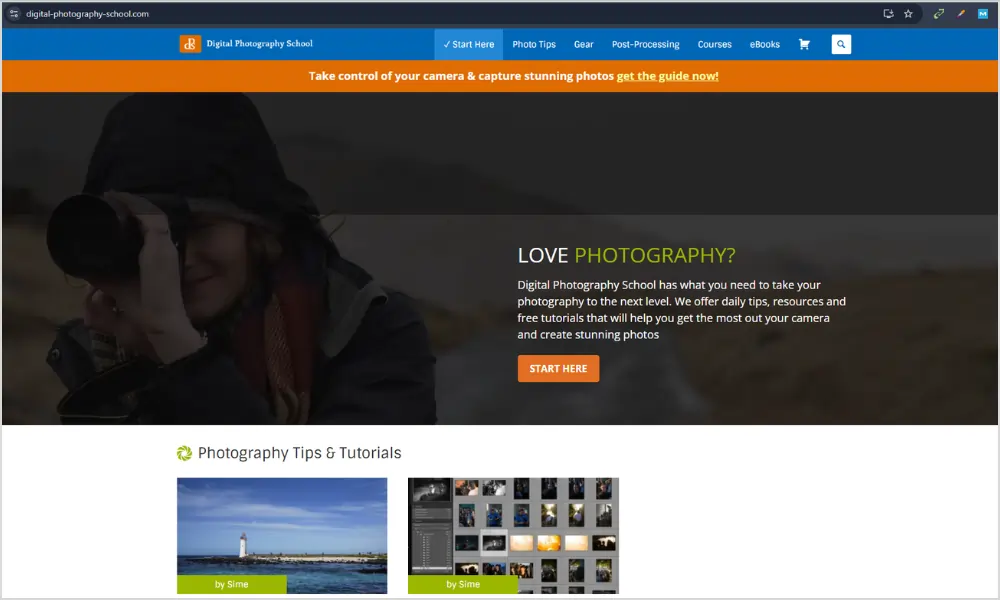
What it does well: every article ends with somewhere useful to go next. You read about shooting in shade, it links you to editing shade photos. There’s never a dead end.
What I stole: I added a little line at the bottom of every wedding gallery that says “see the full day” and “read how we planned for rain.” People click it. They stay longer. They feel taken care of.
It’s also written in plain English. Short paragraphs. No ego. If you have a blog on your photography website, write like this. Answer the question your client actually typed at midnight.
It’s fast on mobile because images support the text, not replace it. That’s a good reminder if you blog. Compress your images. Let the words carry weight.
Good for you if you shoot families or weddings and you’re tired of answering the same five emails. Put the answers on your site. A page called “what to wear” will save you hours.
2. 1x.com
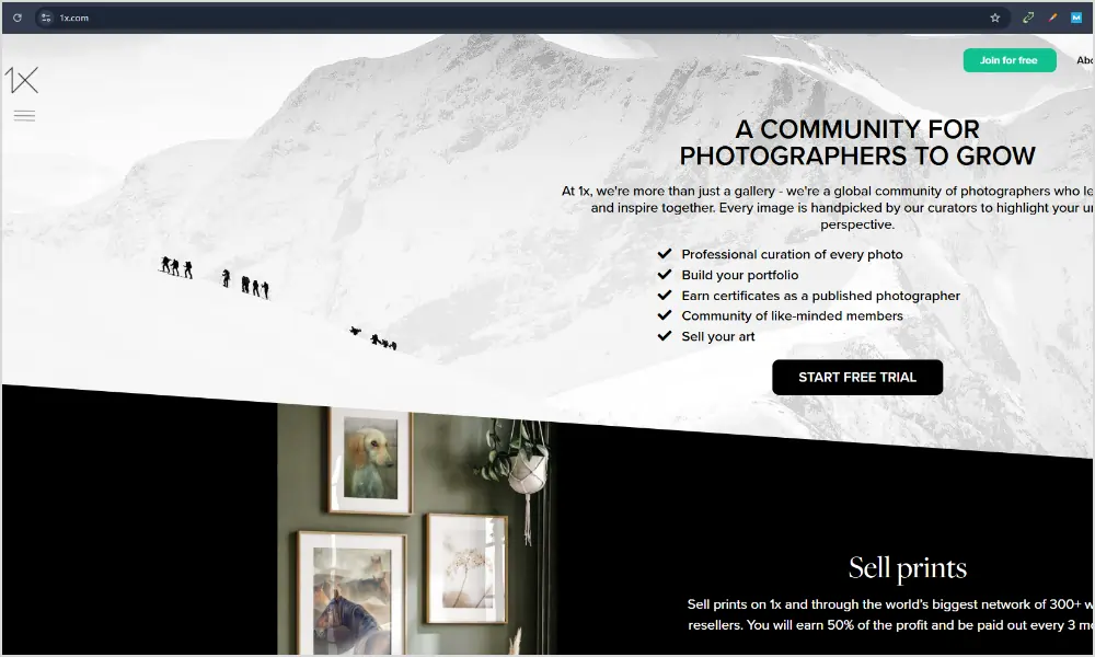
1x hurts my feelings in a good way. They say no to almost everything. Their whole thing is “in pursuit of the sublime,” and every photo is chosen by human curators.
I spent an hour there once and realized my homepage had 43 images. Forty three. No wonder people bounced.
What I stole: I cut my homepage to six images. Just six. The ones that feel like the work I want more of, not the work I’ve done the most of. Bookings went up, not down.
It’s also mostly white space. That feels expensive. You don’t need a dark moody background to look pro. Sometimes you just need room to breathe.
If you want your photography website to feel like a gallery, not a catalog, study how much they leave out. Curation is a skill. Saying no is branding.
3. Stuck In Customs
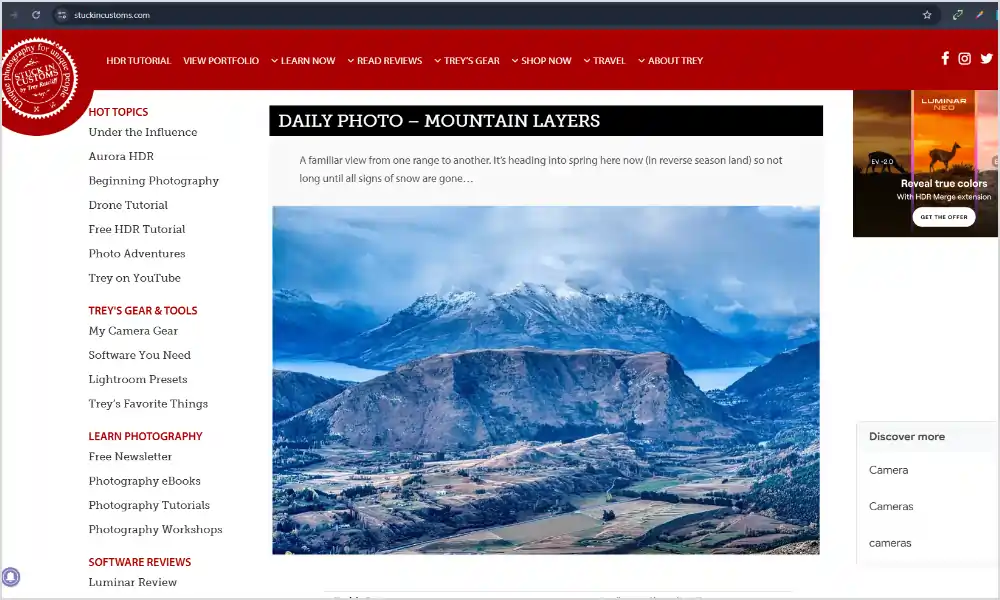
Trey’s site is loud, colorful, personal.
I used to think my site had to be neutral so I wouldn’t scare anyone off. Then I saw this and realized people hire people, not beige templates.
What I stole: I rewrote my about page in first person. I put a photo of me with my dog, not a logo. I started writing like I talk. “I’ll probably bring coffee and make your dad laugh” got me more replies than “I provide a luxury experience.”
He also has clear sections for different things he sells, prints, books, tutorials. If you do more than just shoots, give each thing a home. Don’t cram it all on one page.
Perfect if you’re a personality driven shooter. Travel, elopements, brands. Let the site sound like you.
4. The Luminous Landscape
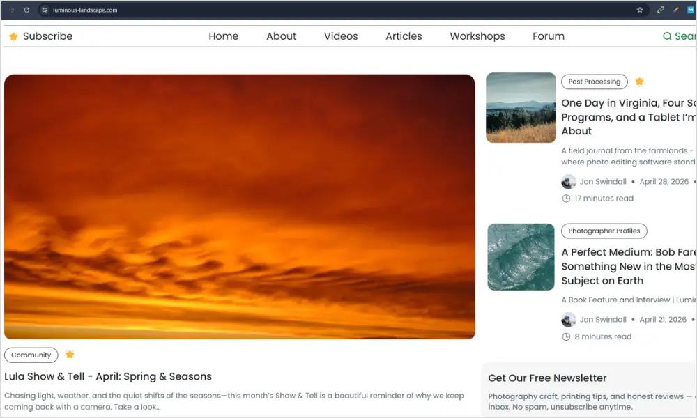
This website is the deep end. Long field reports, honest gear reviews, location guides that read like letters from the road.
I found it when I was planning a trip to Iceland and wanted to know what it actually feels like to shoot there in wind. They told me. The wind knocked the tripod over. That detail sold me more than any perfect photo.
What I stole: long captions. Under my favorite series now, I write a paragraph. Not about my camera. About the light, the cold hands, the couple laughing because the veil flew away. Clients remember stories.
It also taught me consistency beats frequency. They don’t post daily. They post when they have something worth saying. I stopped pressuring myself to blog weekly and started posting one good story a month. It’s better.
If you want your site to build trust over years, not weeks, read a few posts here and notice the tone. Thoughtful, specific, human.
5. Julia and Gil
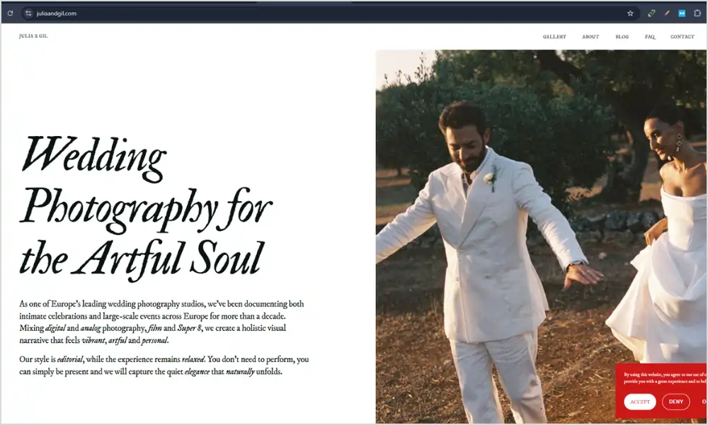
Husband and wife team, photo and film. Their homepage is split down the middle. Left is photo, right is film. You understand their offer before you read a word.
I showed this to my partner and we both went “oh.” No explaining needed.
What I stole: I stopped writing “we offer photo and video services.” I put a still and a six second clip side by side on my homepage. People get it instantly.
Their menu is four words. Work, About, Investment, Contact. I had seven menu items before. I cut three and my contact form submissions went up.
They also start every gallery with a tiny highlight film. Even if you don’t do video, start with your three best images, not 30 average ones.
Great for anyone who does two things and is tired of explaining it.
6. Phil Chester
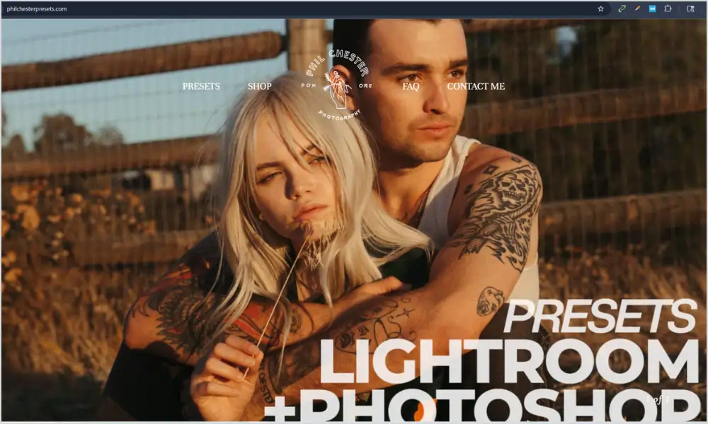
Phil’s site is quiet. Like, almost no words. Three huge photos on the homepage, then a button that says view weddings.
I remember opening it on my phone in a coffee shop and just slowing down. No popups, no “as seen in,” no chat widget bouncing around.
What I stole: restraint. I deleted my homepage slider. I deleted the Instagram feed. I let one image fill the screen. It loads fast and it feels confident.
His about page is maybe 120 words and one portrait. That’s it. I rewrote mine to be shorter and more honest. “I’m based in Portland, I shoot on film and digital, I’ll probably cry at your vows.” Done.
His contact form asks for three things. Date, venue, message. That’s it. I used to ask for how they found me, budget, guest count, favorite color. No one finished it.
If you want your photographer website to feel calm and high end, study this one.
7. Adam Bricker
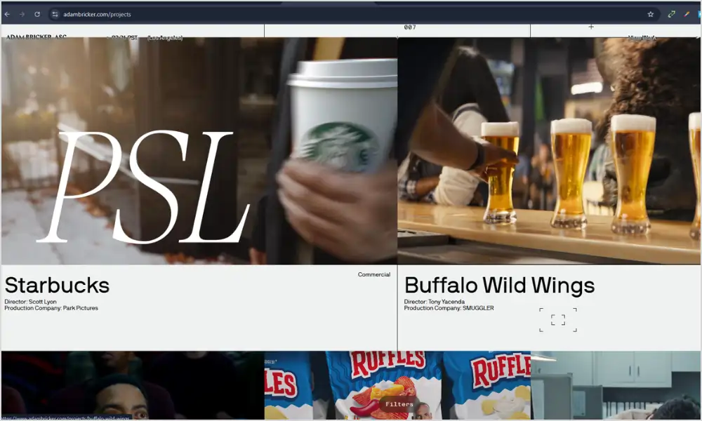
This website feels like a magazine. Dark background, images that pop, projects grouped by feeling not year.
What I love: pacing. He’ll give you a tight portrait, then a wide street scene, then a detail of hands. Your eye never gets bored.
What I stole: I stopped organizing my portfolio by year. I made two galleries: “quiet moments” and “loud parties.” Clients tell me which one they’re drawn to, and that tells me if we’re a fit.
He also keeps a contact button in the corner always. You never have to hunt. I added a sticky “check dates” button on mobile and it helped.
Good for commercial shooters, documentary folks, anyone whose work has range.
8. Detroit Paris
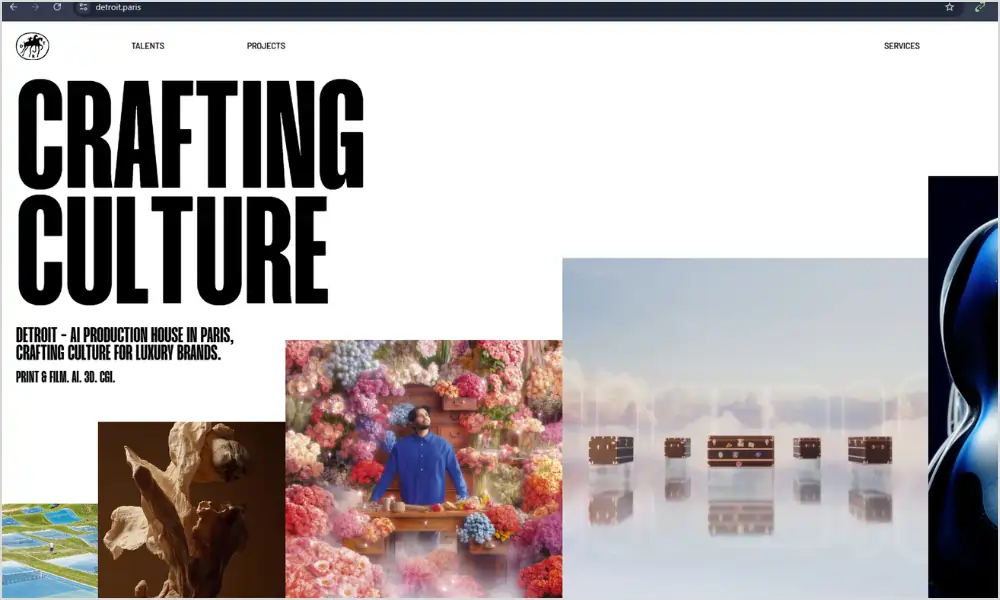
Cinematic. A little grain, a short looping video that doesn’t yell at you, then stills.
I watched their homepage video three times because it was six seconds and muted. That’s the trick. If you use video, keep it tiny and silent.
What I stole: texture. I added a very light paper texture to my background, not a photo, just a hint. It made the site feel tactile without slowing it down.
Every project ends with a client quote. Not at the bottom of a testimonials page no one visits. Right there, after you’ve seen the work. I copied that.
They also keep categories simple. Weddings, Brands, Films. I had eight categories. I cut to three. Life got easier.
Perfect if you want your site to feel modern without being heavy.
9. Larsen Photo Co – Colorado Elopement Guide
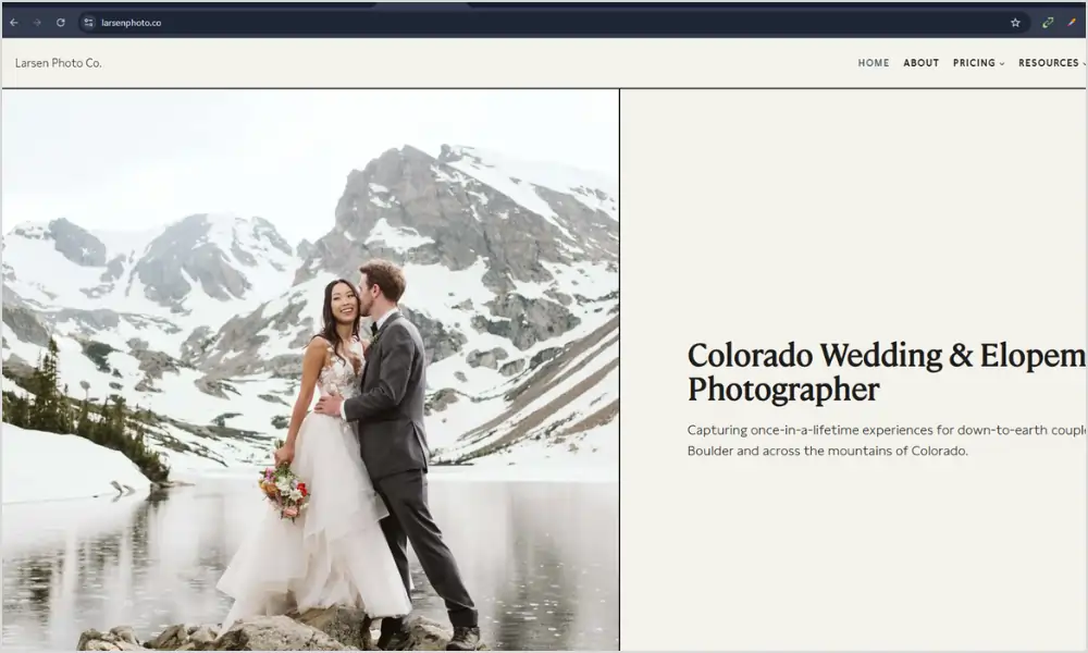
Snapshot
This isn’t just a portfolio, it’s a full guidebook. Nina at Larsen Photo built an entire section called “How to Elope in Colorado” that reads like a friend walking you through the process.
First 5 seconds
You know you’re in the right place if you’re planning a mountain elopement. The headline says exactly what it is, no clever wordplay.
Layout and flow
The page is one long, scannable guide: why Colorado, how to legally get married (Colorado lets you self-solemnize), what to bring, month-by-month weather, permits, even “your dog can sign the license.” Then it links to location guides, timelines, and real galleries. It’s helpful first, sales second.
Copy and voice
First person, local, and honest. She says “I’ve photographed almost 300 elopements” and “I eloped in February myself”. She tells you to arrive two days early for altitude, to get 4WD, to bring fleece leggings under your dress. That’s the stuff couples screenshot and send to their partner.
What I stole from this:
- Name your menu like a client thinks: She doesn’t have a “blog.” She has “Colorado Elopement Guide,” “Best Places to Elope,” “Best Time to Elope.” Copy that. If you shoot in Oregon, make a page called “Where to Elope on the Oregon Coast.”
- Answer the boring legal stuff: She explains marriage licenses, self-solemnization, and dog witnesses. Clients trust you faster when you answer the questions they’re Googling at midnight.
- Link to yourself: Every section ends with “check out my post on…” She keeps people on her site for 10 minutes. That’s better than any Instagram reel.
Mobile experience
It’s just text, photos, and headings. Loads fast on data, easy to read with one thumb. No video background slowing it down.
Who this is for
Any destination, adventure, or elopement photographer. If your clients are planning a trip, not just a photoshoot, build a guide like this. Make your photography website helpful first, pretty second — exactly what Maine Elopement Collective was doing.
10. Lindsey Victoria Photography
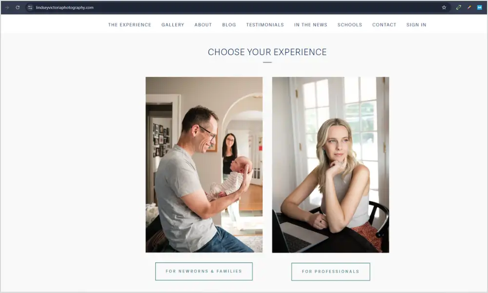
Snapshot
Lindsey shoots families and newborns in Connecticut and NYC, and her homepage does what Ali’s used to do perfectly — it puts a real client quote right under the hero photo.
First 5 seconds
You see a warm in-home photo of a mom and son, then immediately underneath: “Lindsey is a true professional but also down to earth and fun to work with… she is magical with kids and makes the process fun for them (and therefore for us, too!)” — Hilary, Brooklyn, NY. Full name, town, specific detail. No anonymous 5-star graphic.
What I stole from this:
- Put trust at the top, not the bottom. I used to hide testimonials on a separate page. I moved one quote to right under my hero image and inquiries felt warmer instantly.
- Show real life, not just golden hour. Lindsey’s homepage features in-home sessions in Brooklyn Heights — messy living rooms, natural window light, kids being kids. That’s where your clients live. When they see it, they think “oh, she can handle us.”
- Use human button text. Her site splits into “Choose Your Experience” — Newborn & Family vs Branding. It’s not “contact.” It feels like the next step, not a commitment. On my family page I changed my button to “check dates” and more people clicked.
Copy and voice
Her about section starts “I am a lifestyle photographer. I photograph families who want to truly see themselves in their photos.” No fluff about “timeless heirlooms.” Just plain words about connection and putting you at ease.
Mobile experience
One column, big photos, short paragraphs. Loads fast because she’s not running a slider or Instagram feed on the homepage.
Who this is for
If you shoot families, newborns, or anything with chaos and toddlers, study how warm and safe her site feels. It’s the same lesson Ali’s site taught — trust first, pretty second.
11. Heather K. Purdy
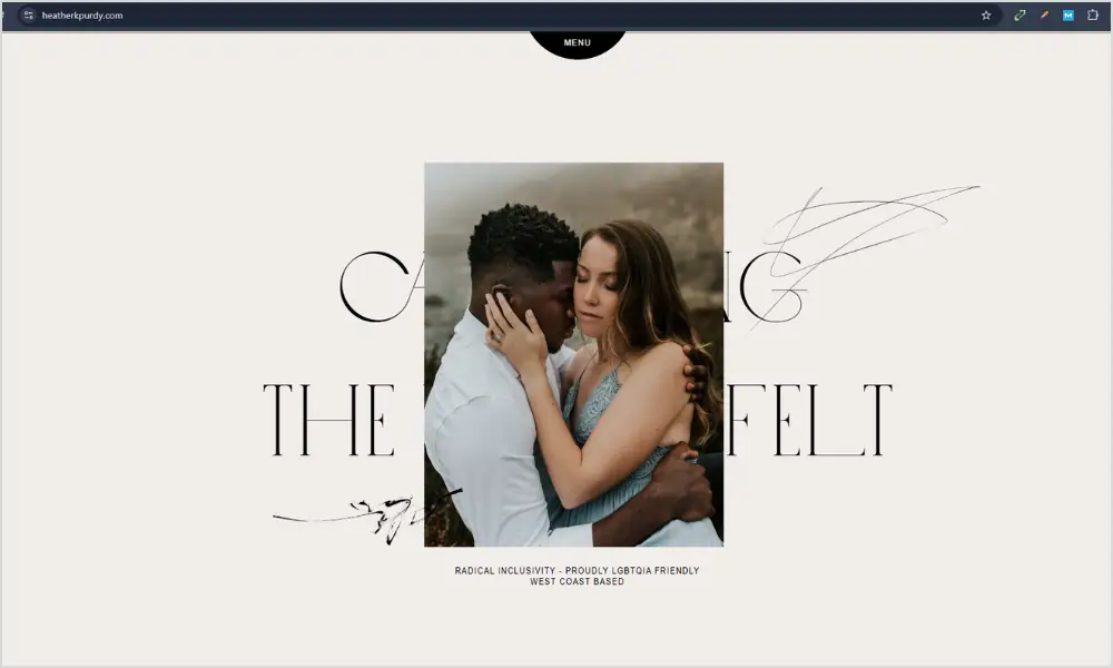
Heather does weddings and couples, and she doesn’t mix them. Homepage has two big buttons. Pick your path.
I was mixing everything in one grid and confusing people. I split mine. Weddings go one way, families go another. Inquiries got clearer.
What I stole: different language for different people. My wedding page is calm and romantic. My family page is playful and short. Same me, different conversation.
She also has a tiny behind the scenes video on her about page. Just her laughing while shooting. It humanizes everything.
Great if you do two distinct things and you’re tired of getting the wrong inquiries.
12. Vivian Maier
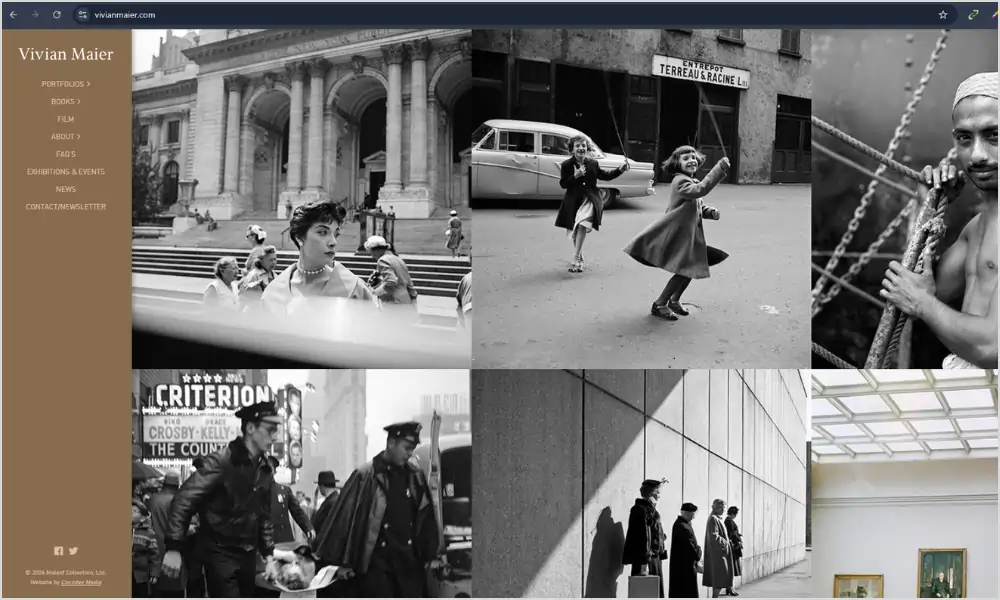
The official archive is almost nothing. Black background, small type, photo centered, date and location underneath.
It’s a reminder. When the work is strong, you don’t need tricks.
What I stole: I stopped chasing trends. No parallax, no fancy cursor, no animation that takes three seconds to load. I let the photos be the design.
I also started adding context. Not just “Sarah and John,” but “October, Smith Rock, wind so strong the veil flew into a tree.” People remember that.
If you want your photography website to still look good in ten years, study this one. It will age well because it doesn’t try to be cool.
12 Photography Websites You Should Study
Hand-picked for layout, storytelling, and client clarity — not just pretty pictures.
| # | Website Name | Type | What to Study | Link |
|---|---|---|---|---|
| 1 | Digital Photography School |
Learning hub | How every article links to the next useful step | Visit → |
| 2 | 1x.com |
Curated gallery | Ruthless editing and white space | Visit → |
| 3 | Stuck In Customs |
Travel and personal brand | Personality in design and voice | Visit → |
| 4 | The Luminous Landscape |
Deep articles and field reports | Long captions and storytelling | Visit → |
| 5 | Julia and Gil |
Photo and film team | Split screen clarity for two services | Visit → |
| 6 | Phil Chester |
Wedding photographer | Minimal restraint and fast loading | Visit → |
| 7 | Adam Bricker |
Editorial and commercial | Pacing with verticals and horizontals | Visit → |
| 8 | Detroit Paris |
Cinematic studio | Subtle texture and short muted video | Visit → |
| 9 | Larsen Photo Co |
Elopement guide | Helpful content that answers real client questions | Visit → |
| 10 | Lindsey Victoria Photography |
Family and newborn lifestyle | Real testimonials and warm in-home photos at the top | Visit → |
| 11 | Heather K. Purdy |
Weddings and couples | Clear paths for different clients | Visit → |
| 12 | Vivian Maier |
Fine art archive | Timeless minimal design that gets out of the way | Visit → |
What all 12 Photography Websites have in common
After staring at them way too long, here’s what I keep seeing.
- They use plain words in the menu. Work, About, Contact. Not “the experience” or “investment journey.”
- They edit hard. Even the big teaching sites don’t show everything. They show the right thing.
- They load fast on a phone. That’s not luck, that’s compression and simple layouts.
- They sound like a person. You can hear a voice in the headlines.
- They always give you somewhere to go next. No dead ends.
That’s it. That’s the whole secret. The rest is taste.
My biggest site fails so you can skip them
Fail one: the everything gallery. I once put 87 photos from one wedding online because I couldn’t choose. No one looked past image 20. Now I cap at 25.
Fail two: the clever menu. I had “investment experience.” No one clicked it. I changed it to “pricing” and inquiries doubled.
Fail three: the novel contact form. I asked for budget, guest count, how they found me, favorite color. People abandoned it. Now I ask for three things: date, location, what you’re dreaming up.
Fail four: the Instagram feed on my homepage. It slowed everything down and showed photos that weren’t my best. I deleted it.
Fail five: no prices. I was scared. I added “weddings start at $4,200” and the wrong fits stopped emailing. The right ones stayed.
How I choose images now (the three pass edit)
Pass one: dump everything you like into a folder. Don’t think.
Pass two: delete anything that doesn’t feel like the work you want more of. Be brutal. If it’s from 2019 and you wouldn’t shoot it the same way now, it goes.
Pass three: show the folder to a non-photographer friend. Ask them to pick ten that make them feel something. Not the sharpest, not the most technically perfect. The ones that make them feel. Those ten go on your site.
I do this every six months. It keeps my site honest.
Writing headlines that don’t sound like a robot
I used to write “capturing authentic moments with a timeless editorial approach.” I have no idea what that means now.
Here’s what works for me now:
- Say where and what. “I photograph rainy elopements on the Oregon coast.”
- Say how it feels to work with you. “I’ll bring extra umbrellas and make your dad laugh.”
- Say the next step. “See a full wedding” not “portfolio.”
Read it out loud. If you wouldn’t say it to a client over coffee, rewrite it.
The anatomy of a homepage that actually converts
After stealing from these twelve, mine looks like this now:
- One big photo that feels like my favorite kind of day
- A headline in plain words
- One sentence about who I’m for
- One button that says “see my work” or “check dates”
- Then a short client quote with a full name
- Then six images, not sixty
- Then a photo of my face and two sentences about me
- Then footer with contact
That’s it. No slider, no feed, no pop-up. It loads fast and people actually click.
The pricing page without panic
I used to hide pricing because I was scared. Now I have a page that says:
- Weddings start at $4,200
- What’s included in every collection
- Two real timelines (8 hours and 10 hours)
- A note that says “if this feels out of reach, I have associate options, ask me”
That’s it. No packages with confusing names. People email me and they already know the range. It saves us both time.
Blog posts that book, not just pretty galleries
The posts that bring me inquiries are not my prettiest weddings. They’re the helpful ones.
- “What to wear for a windy coast session (with photos of real families)”
- “How long a family session takes with toddlers (spoiler: 45 minutes max)”
- “What happens if it rains on your elopement day”
Write like you’re answering a text from a nervous client. Use real photos from real sessions, not just golden hour perfection. That’s what Maine Elopement Collective taught me.
Speed without hiring a developer
I’m not technical. Here’s what I do:
- I export photos for web at 2000px on the long edge, not 6000px
- I use a free compressor before uploading
- I don’t use video backgrounds over 6 seconds
- I deleted plugins I wasn’t using
- I test on my phone using data, not wifi
My site loads in under two seconds now. That alone got me more inquiries.
Accessibility basics that also help everyone
- Add alt text that describes the photo like you would to a friend. “Bride laughing while veil blows sideways at Cannon Beach” not “IMG_4829.”
- Make buttons big enough for thumbs
- Use contrast. Light grey text on white is pretty and unreadable
- Don’t rely on color alone to show a link, underline it
It’s not just nice, it helps people book you.
When to hire help
I DIY’d for years. It was fine. Then I hired a designer for one day to audit my site. Best $400 I spent. She didn’t redesign it. She moved three buttons, rewrote two headlines, and cut my homepage images from 22 to 7. Inquiries went up 30 percent the next month.
You don’t need a full custom build. Sometimes you need fresh eyes for an hour.
Keeping it alive after launch
A photography website is like a plant. Water it sometimes.
Once a quarter I do a 90 minute refresh. I swap the homepage hero for something recent I love. I add one new story with five photos and a short paragraph about the day. I delete the oldest gallery that doesn’t feel like me anymore. I ask one recent client for two sentences and I put it near the top.
That’s it. It keeps the site feeling current without a full redesign.
Also, once a month, open your site on a friend’s phone. Watch them try to contact you. Don’t help. You’ll learn more in two minutes than any analytics dashboard will tell you.
My quick checklist before you hit publish
- Can a stranger tell what you shoot in three seconds
- Is your contact button visible without scrolling on mobile
- Do you have one real testimonial with a full name and town
- Are your images compressed and sharp
- Does your about page have a photo of your face
- Does every page end with one clear next step
- Have you deleted anything that doesn’t help a client decide
If you can say yes to all seven, you’re good. Ship it.
Last thought
Don’t try to make your site look like all twelve of these. You’ll end up with a mess that doesn’t feel like you.
Pick the feeling you want. If you want calm, lean on Phil Chester and Adam Bricker. If you want warm and helpful, lean on Ali Daugherty and Maine Elopement Collective. If you want bold and personal, lean on Stuck In Customs and Julia and Gil. If you want timeless, lean on Vivian Maier and 1x.
Then build a photography website that feels like you on your best day, the day you’re behind the camera and everything clicks.
Open these twelve again next week. Write down one thing from each you’ll do, and one thing you’ll skip. You’ll have a 24 point plan that’s better than any course I’ve bought.
Your photos deserve a home that works as hard as you do. Build that, and the right people will stay longer, trust faster, and hit contact.
Read more Blogs
50 Simple Photography Techniques That Will Instantly Make Your Pictures Look Better – From Beginner Basics to Pro-Level Mastery
From Black Frames to Milky Way Magic: 15 Real Tips for Stunning Milky Way Shots