Real estate photography is all about stunning and uniform images. Usually, potential buyers come to the location after their online first impressions, and well-edited photos can scarcely lead to their perception of the property. Therefore, correctly using colour is very important in real estate editing.
Colour matching in Photoshop is a common skill in real estate photo editing that helps all photos in a set have the proper tone, colour, and look. Adobe Photoshop provides all the necessary tools to perform a colour match operation. Thus, in this guide, we will discuss how to apply them correctly for your real estate photos.
Table of Contents
The Importance of Color Matching in Real Estate Photography
Matching colours creates visual harmony between pictures, making the images look more consistent in light, colour temperature, and overall appearance. For real estate, this translates to:
- Accurate Representation: The correct colour for wall paint, flooring, and furniture will be verified.
- Professional Quality: A series of pictures looks sleeker when coherent, which impresses viewers.
- Emotional Appeal: Warm and vivid colours create a sense of comfort, a crucial factor in selling real estate.
Typical Issues in Real Estate Color Matching
- Different Light Sources: Shooting inside a property often involves a mix of natural and artificial light, leading to colour temperature inconsistencies.
- Wide Dynamic Range: High contrast can create overexposed or underexposed areas with uneven tones.
- Batch Editing: Maintaining consistency across many images can be challenging.
Step-by-Step Guide to Color Matching in Photoshop
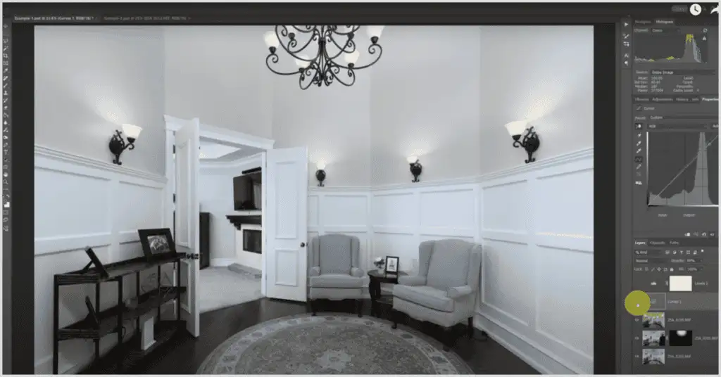
Step 1: Import and Organize Images
Start by importing your photos into Photoshop. Arrange them into layers or use Adobe Bridge for smoother workflow when dealing with multiple files. This organization helps effectively, making the editing process more fruitful.
Step 2: Adjust White Balance
White balance is a fundamental part of getting colours right. Follow these steps:
- Open the Camera Raw Filter (Filter > Camera Raw Filter).
- Use the White Balance Tool (eyedropper icon) and click on a neutral grey or white area of the photo.
- Adjust the temperature and tint sliders for fine-tuning.
- Apply identical white balance settings across all images to ensure continuity.
Step 3: Use the Match Color Tool
The Match Color tool in Photoshop excels in color matching. Here’s how to use it:
- Open the Image to be edited and the reference image.
- Go to Image> Adjustments > Match Color.
- In the Match Color dialog box:
- Choose the source file (reference image).
- Adjust the Luminance, Color Intensity, and Fade sliders to achieve the desired result.
This tool is invaluable for exterior and interior photos where matching tones yield the best results.
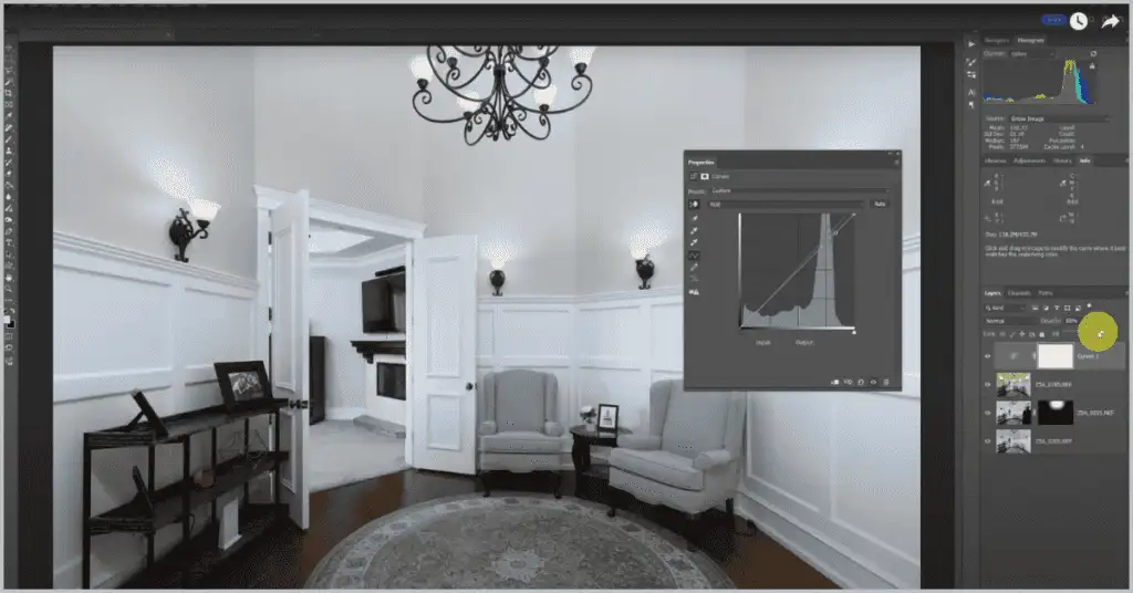
Step 4: Utilize Adjustment Layers
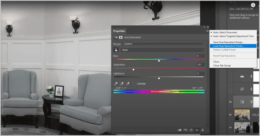
Adjustment layers allow for non-destructive editing. Their benefits include:
- Hue/Saturation: Control the overall hue of the photo or target specific colours to match lightness and darkness.
- Color Balance: Adjust shadows, midtones, and highlights.
- Curves: Control brightness and contrast, which impact colour perception.
Group adjustment layers and apply them to multiple images for consistent results.
Step 5: Correct Lighting Discrepancies
Lighting factors such as shadows, light direction, and time of day greatly influence colour temperature. Techniques include:
- Dodge and Burn: Lighten or darken specific areas to correct exposure.
- Gradient Maps: Apply uniform lighting conditions across all images.
- Use the Selective Color: adjustment for mixed lighting scenarios to target specific light sources like tungsten or daylight.
Step 6: Check for Color Casts
Color casts often result from incorrect lighting. To address this:
- Use the “Neutralize” option in the Match Color tool.
- Adjust colours manually via the Levels and Curves tools.
Step 7: Batch Process Images
Consistency is critical in real estate photography. To streamline the process:
- Record an action with your desired colour-matching adjustments.
- Go to File > Automate > Batch.
- Apply the action to a folder of images for uninterrupted editing.
Step 8: Final Quality Check
Before exporting the images, ensure all errors are addressed:
- Verify colour tones, lighting, and overall exposure.
- Zoom in to check for artefacts and details.
Tips for Effective Color Matching in Real Estate Photos
- Calibrated Monitors: Regularly calibrate monitors for accurate colour representation.
- RAW Files: Use RAW files for more detailed colour information.
- Consistent Settings: Maintain consistent camera and lighting settings throughout the shoot.
- Presets: Save frequently used settings as presets for quick application.
- Collaborate with Clients: Review images with the property owner or realtor to ensure their desired look is achieved.
Conclusion
By practising the techniques and utilizing the tools emphasized in this guide, you can achieve more organized, professional, and in-demand results for prospective buyers. Consistent colour editing enhances quality and elevates your reputation as a high-quality real estate photographer.
Color consistency is critical for interiors
Color matching is especially important in real estate interiors, where mixed lighting can make walls, floors, and cabinets look inconsistent from room to room. The edit should feel natural and accurate.
For full listing sets, color correction works best as part of a complete property-editing workflow.
Why colour matching matters for real estate and product photos
Colour matching is not only a Photoshop technique; it is a trust signal. In real estate photos, buyers expect wall colours, flooring, cabinetry, and natural light to look believable from one image to the next. If one room looks warm orange and the next looks cold blue, the gallery feels inconsistent even when each image is technically sharp.
For product photos, colour matching protects brand accuracy. Fabric, furniture, artwork, wood, and painted surfaces should stay close to the real item because customers make decisions based on what they see. A strong colour matching workflow reduces returns, improves visual consistency, and makes a product or property set feel professionally controlled.
The safest approach is to correct exposure first, then neutralize white balance, then match saturation and contrast across the image set. For interiors, compare rooms under similar lighting and avoid pushing whites too far. For product work, use a reference frame or neutral card whenever possible so the edit is based on a real color target rather than guesswork.
When editing a full property set, check colour matching again after resizing and export. Web compression, different screens, and bright white page backgrounds can make small colour shifts more obvious. A final side-by-side review helps keep kitchens, bedrooms, exteriors, and detail shots consistent before the gallery is delivered.