
This real estate HDR photo editing project brought a brighter, more consistent finish to a property’s interior photographs. The client wanted professional, crisp images with well-lit rooms and properly aligned lines. These three selected views show the result in a bedroom, living room and kitchen.
The strongest change is the color treatment. A pronounced yellow cast in the source frames gives way to more neutral ceilings, wall panels and cabinets. At the same time, the wood floors, fabrics, dark worktops and metal fittings retain their differences.
The client brief and source photographs
The brief combined four priorities: a professional appearance, crisp detail, proper alignment and well-lit interiors. The selected source frames presented different lighting conditions within the same listing. The bedroom mixed bright window light with a warm interior; the living room had deep shadows around the seating; the kitchen was strongly affected by warm ceiling and under-cabinet lighting.
Each selected view had five JPEG source exposures. The original finished JPEGs for these three rooms measure 6,000 × 4,000 pixels, matching the dimensions of their source frames. The comparisons below show three finished views from the larger listing project.
Before shows the camera’s standard 0 EV exposure from each five-frame bracket. After shows the delivered HDR edit. The divider and separate image links make both versions available to view.
Bedroom HDR editing: neutral color with texture and window detail
The bedroom’s source exposure gives the pale ceiling, paneled wall and bedding a strong yellow-orange tone. The bed occupies much of the frame, so the warm cast spreads across both the room’s surfaces and its main feature. The brighter windows create a further contrast with the interior.
In the final edit, the ceiling and wall panels look more neutral, while the bedcover’s woven texture and folds remain visible. The wood floor keeps a warmer tone than the walls, and the curtains remain distinct from the window frames. Outdoor foliage and roof detail are clearer in the finished window area. The isolated dark spot above the headboard is also absent from the final wall panel.
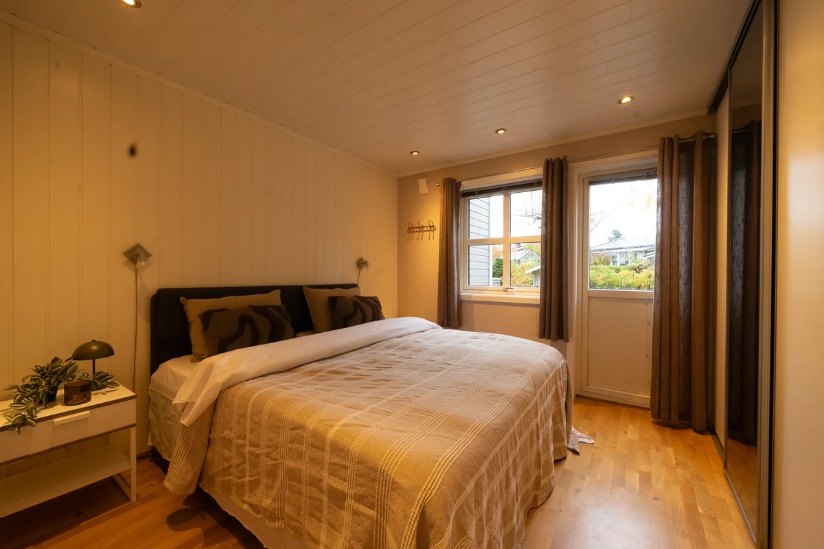
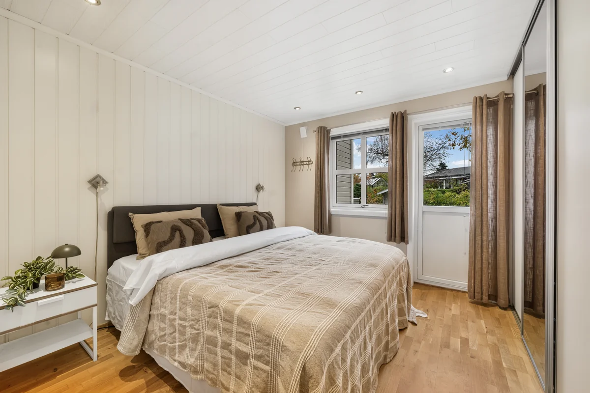
BeforeAfter
View source exposure · View final edit
Living room HDR editing: brighter seating with natural depth
The living-room source is darkest around the foreground sofa, coffee table and television. Warm wall lights add a yellow tone to the pale paneling, while daylight at the far end creates a brighter area around the door. These differences make the seating area harder to read in the single source exposure.
The final gives the gray upholstery, cushions and glass table a clearer presence. The ceiling and wall panels have a lighter, more neutral appearance, and the artwork’s greens and blues are easier to distinguish. The television remains dark, the wood floor retains its warmth, and shadows beneath the table and furniture preserve depth. The result is a brighter interior with separation between its materials and furnishings.
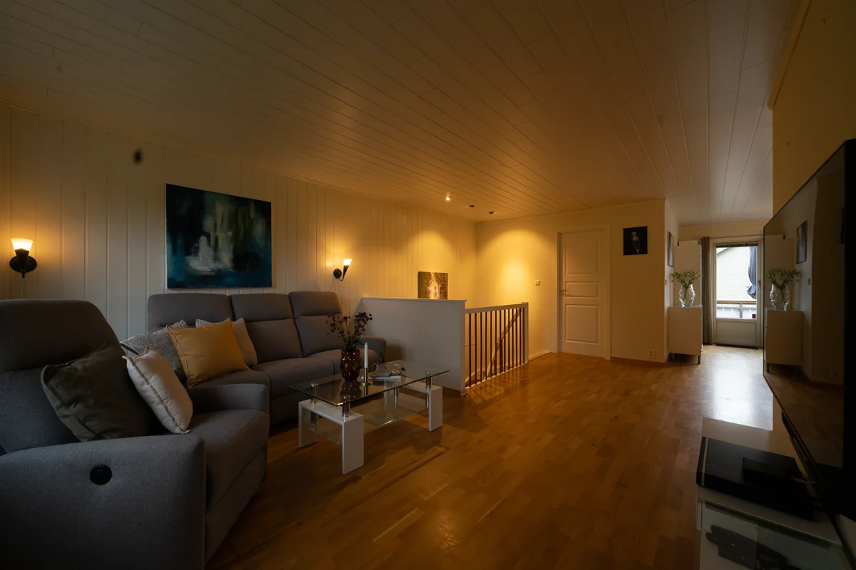
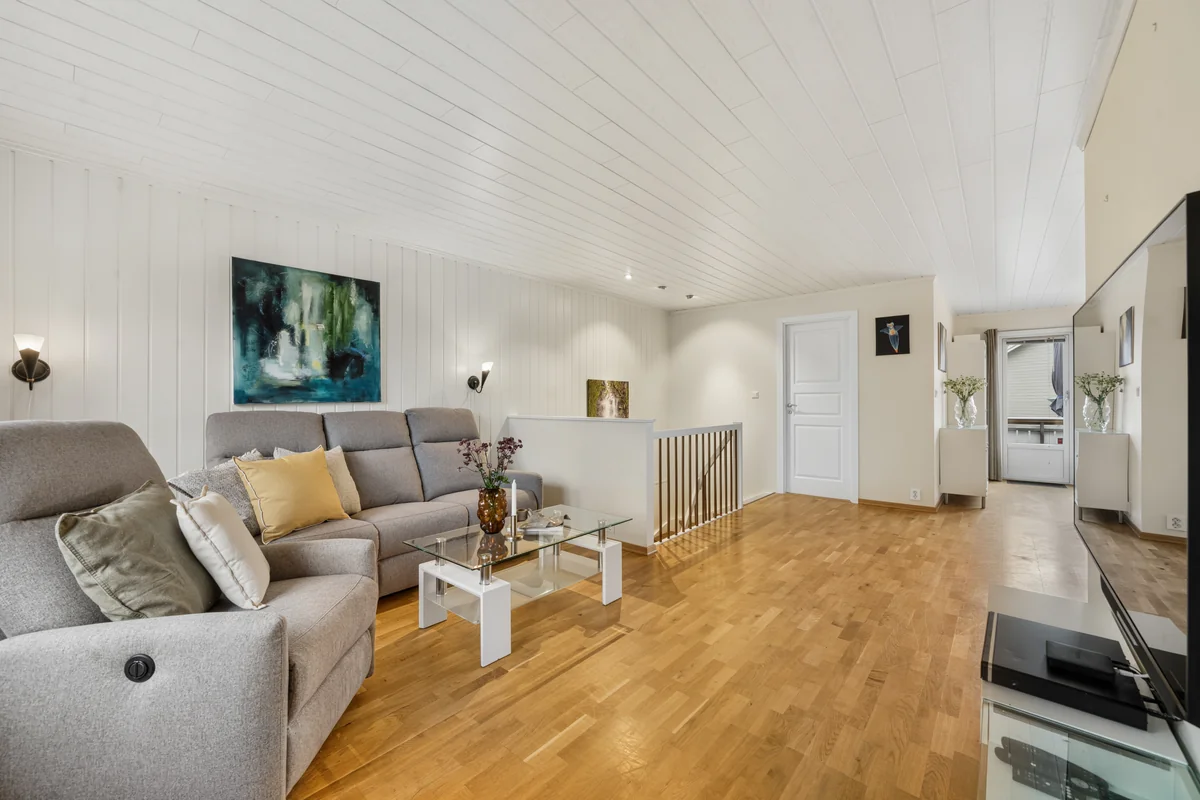
BeforeAfter
View source exposure · View final edit
Kitchen HDR editing: cleaner whites and defined surfaces
The kitchen source combines a dark overall exposure with a strong warm band beneath the upper cabinets. The white doors, refrigerator and paneled ceiling take on different yellow and gray tones. The dark counters and tiled backsplash are visible, but the lighting draws attention away from the cabinetry.
The finished edit gives the cabinet fronts and ceiling a more consistent neutral appearance. Tile joints, cabinet-panel edges and metal handles remain clear, while the stainless-steel extractor hood stays distinct from the painted surfaces. The worktops remain dark and the floor tiles keep their warmer color. The kitchen therefore fits the brighter finish of the other rooms without losing its own material contrasts.
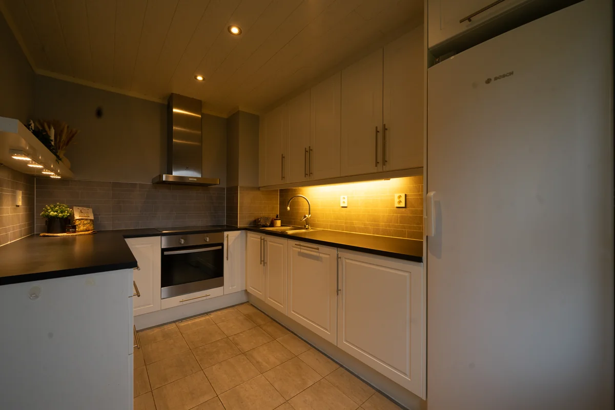
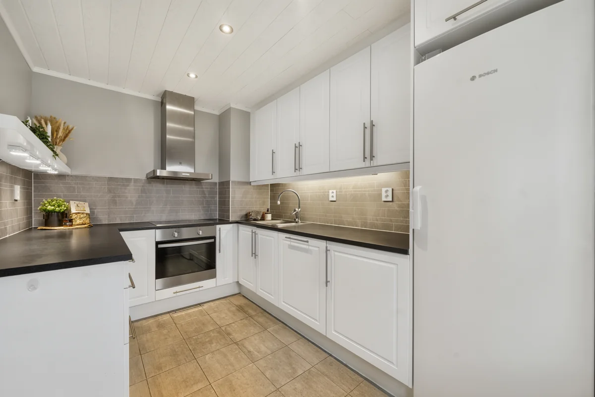
BeforeAfter
View source exposure · View final edit
The finished gallery: consistent color, light and detail
Across these three rooms, the pale surfaces now sit within a similar color range. The bedroom’s ceiling panels, living-room walls and kitchen cabinets no longer carry the strong yellow treatment visible in the source frames. That shared finish connects the selected views as one listing gallery.
The brighter presentation also reveals different kinds of detail: the woven bedcover, sofa upholstery, glass coffee table and kitchen tile joints. Dark elements still provide contrast, including the television, worktops and shadows beneath furniture. The warm floors remain visibly different from the lighter walls and cabinets.
Clean ceiling panels, defined door frames and clear cabinet edges support the crisp, orderly presentation requested in the brief. The selected photographs show how color balance, interior brightness and retained surface detail work together in a finished real estate HDR editing gallery.
Client feedback: the professional look and color they wanted
The client was extremely happy with the completed photographs and liked the overall color treatment. Their feedback was positive about the professional appearance of the gallery, which was the central aim of the brief.
The requested finish was specific: crisp, properly aligned and well-lit interiors. The selected results show that direction across the brighter bedroom, clearer living-room seating and more neutral kitchen. Wood, upholstery, tile and metal remain distinguishable, while the rooms share a consistent finish. Together, the client’s response and the visible changes show the outcome of this project: a more polished presentation of the same interiors.