
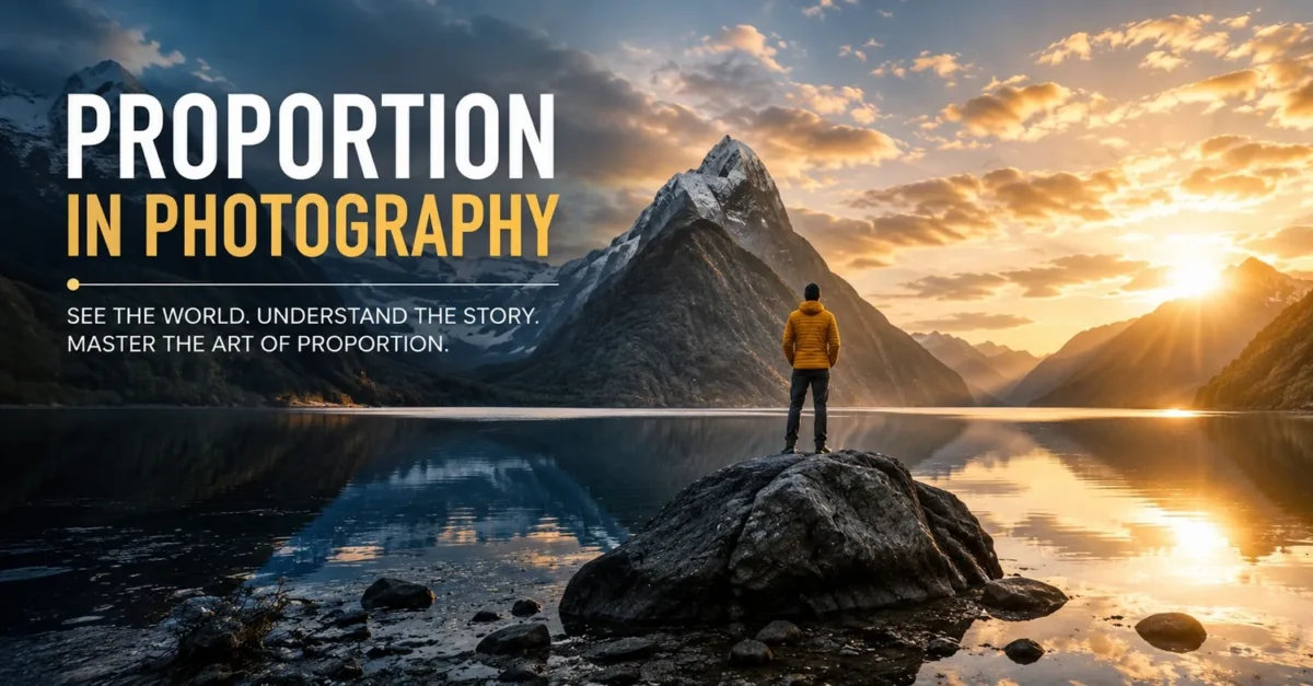
Key Takeaways: Proportion in photography is not about pretty rules, it’s about where the eye goes first and what price it expects. Get the size, color, space and framing wrong and your photo feels cheap, get it right and even a phone shot looks like luxury. This guide breaks down the 5 real types of proportion that actually make people buy.
Ever look at a photo and feel something is off, but you can’t explain why?
The light is nice. The model looks great. The location is perfect. But the legs look short. Or the dress looks stretched. Or a huge building looks tiny. Or a cheap product looks expensive for no reason.
That feeling is proportion. And once you learn to see it, you can’t unsee it.
I learned this the hard way on an early fashion catalog shoot. I shot everything on a 24mm wide lens because I wanted to show more of the background. The client loved the location but called me the next day and said, “Why does every dress look 3 inches longer than it really is?”
It wasn’t the dresses. It was me. I had messed up proportion.
If you searched for what is proportion in photography, or you want to see real photos of proportion, understand proportional photography, golden ratio in composition, and photo composition framing, this is the only guide you need to bookmark.
Table of Contents
What is Proportion in Photography?
Let’s keep it simple and human.
Proportion in photography is how everything inside your frame relates to everything else in size, distance, and importance.
Think of your frame as a small stage. You are the director. You decide who stands where, who looks big, who looks small, who gets the spotlight. If you arrange it well, the audience gets the story instantly. If you arrange it badly, even great talent looks confused.
That is all proportional photography is. It is making relationships inside the picture make sense.
A strong proportion picture does three things without you even thinking:
- It instantly shows what is most important
- It shows how big things are compared to each other
- It feels natural and comfortable to the eye
Take a proportion picture of a model in a long gown. If the gown fills 90% of the frame, we notice texture and stitching. If the model is small with 70% empty space around her, we feel drama and luxury. Same model, same gown, different proportion, completely different story and price perception.
That is the power of proportion in photography. It is storytelling through size and space.
When we talk about a good proportion photo or proportion pictures, we mean the photographer controlled those relationships on purpose, not by accident.
Proportion vs Scale vs Balance
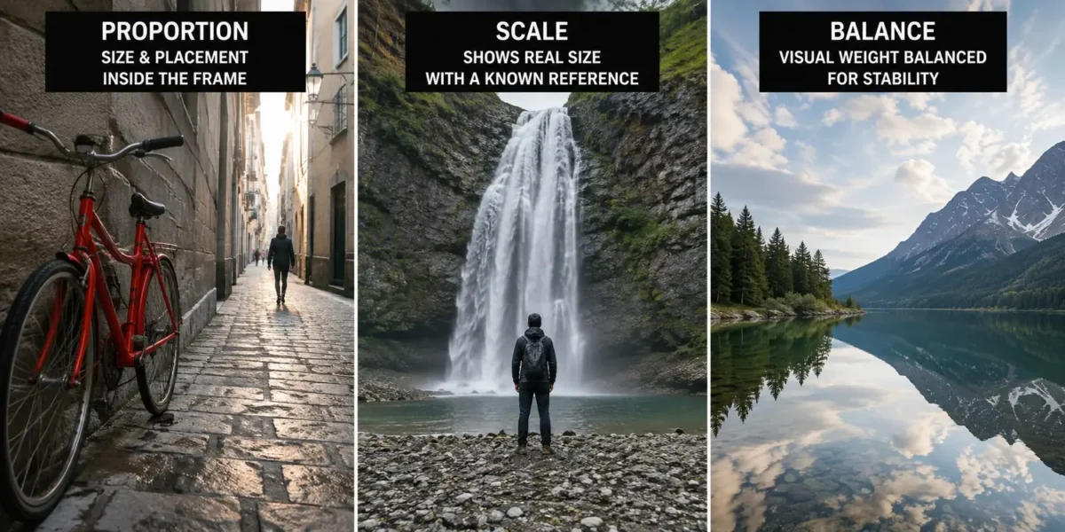
Proportion is about inside the photo. Proportion answers, how do things relate to each other inside this exact frame? This is what artists call proportion as a principle of art – how big is the person compared to the waterfall in your composition?
Scale is about the real world. Scale answers, how big is this in real life? You add a known object to show size. A person next to a waterfall. The person gives scale to the waterfall. Scale needs a reference outside the photo.
Proportion is about inside the photo. Proportion answers, how do things relate to each other inside this exact frame? How big is the person compared to the waterfall in your composition? Where did you place them? That is proportion.
Balance is about visual weight. Balance answers, does the photo feel stable? If you have a dark heavy bag on the left, you need something on the right to balance it, otherwise the image feels like it is tipping over.
Simple way to remember:
- Scale = Subject vs Real World
- Proportion = Subject vs Subject inside the frame
- Balance = Left vs Right weight
Once you get this difference, you will instantly see why some proportion images feel so much better than others.
Why Proportion in Photography Matters So Much
Because viewers judge it in under half a second. It is subconscious, but it decides if they stay or scroll.
It builds trust. The human eye is used to seeing the world like a 50mm lens on a full frame camera. That is our natural baseline. When your proportion photo is close to that, it feels honest. When a dress looks 2 inches longer online than it is in person because you shot from a low angle, the customer returns it. Good proportion builds trust. Bad proportion drives returns. Every major online store obsesses over this.
It creates emotion. Think of that classic image of proportion of a tiny boat under a massive iceberg. The boat is not the story. The feeling of being tiny against nature is the story. That emotion comes purely from proportion. You can make people feel awe, power, loneliness, or luxury just by changing how big things are relative to each other.
It adds depth. Without good proportion, your photo looks flat like a poster. With good foreground, middle ground, and background proportion, you get that 3D feeling that makes people stop scrolling.
It guides the eye without words. The best proportional photos don’t need arrows. Your eye just knows where to go first, second, and third. Size and placement do the guiding.
For fashion and product, it directly affects sales. Wrong body proportion makes a $120 dress look like $30. Correct garment to model proportion makes a $40 dress look premium. Proportion is a business skill, not just an art skill.
The 5 Types of Proportion You Actually Use on Shoots
Competitor blogs say there are 2 types. In real work, there are 5 that you will use constantly.
1. Perfect or Standard Proportion
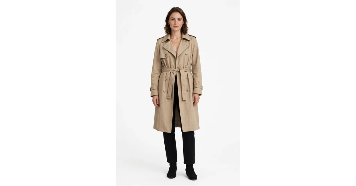
This is reality, but polished. Everything looks like it should in real life, just at its best. This is what you want for 90% of client work – product listings, online stores, headshots, real estate. Size relationships stay accurate. If a person is 5’8″, they look 5’8″. No tricks. This is what marketplaces demand for main images.
2. Altered or Distorted Proportion
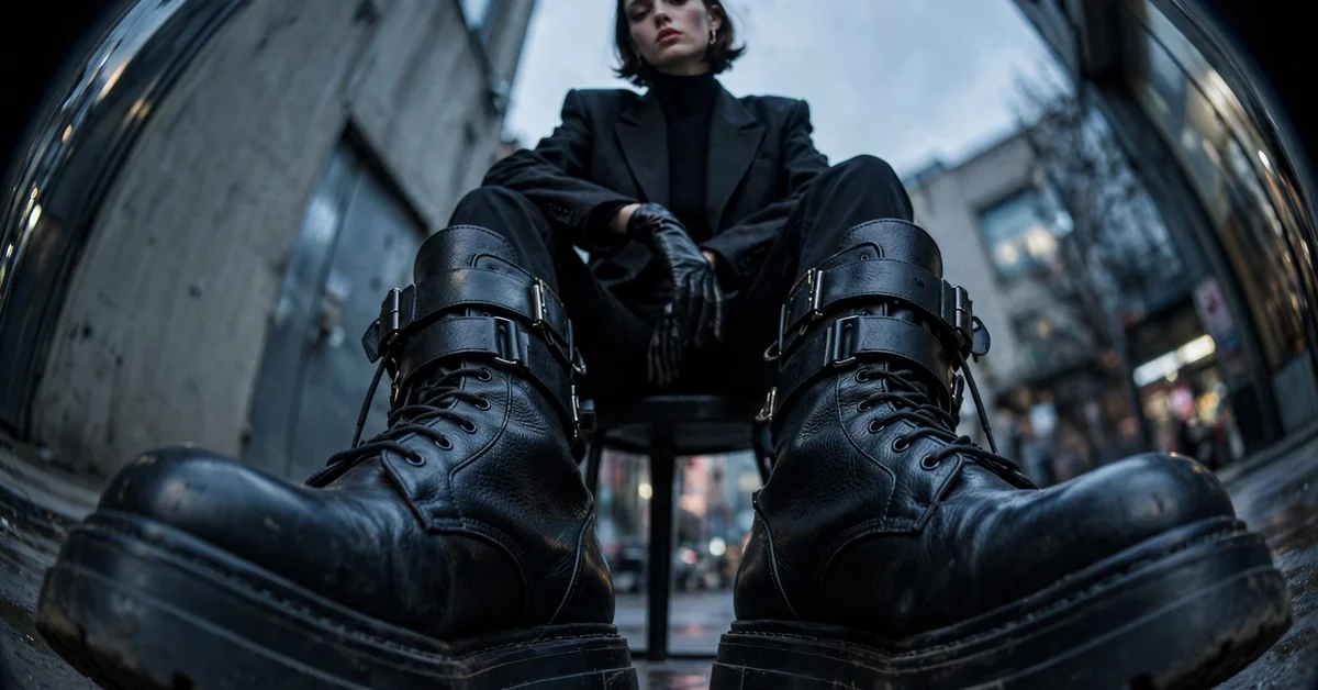
You break reality on purpose for creative effect. You get super close with a wide lens and make the shoes look huge. You use a fisheye. You do forced perspective where someone looks like they are holding the sun between their fingers. High fashion editorials love altered proportion because it looks bold and edgy. It works when intentional, not when accidental.
3. Hierarchical Proportion
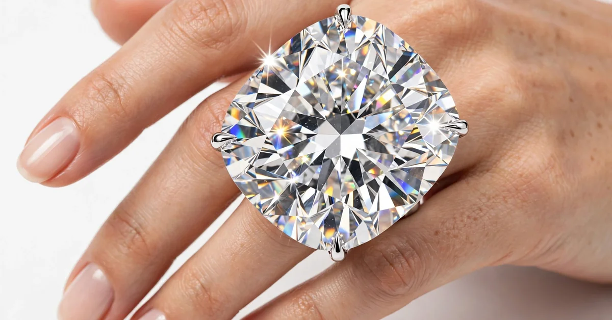
You make the most important thing the biggest, even if in real life it is small. In a jewelry ad, the ring might be bigger than the hand. Because you are selling the ring, not the hand. In your proportion picture, your handbag can be bigger than the model if the handbag is the hero product for that ad. This is sales driven proportion.
4. Color and Light Proportion
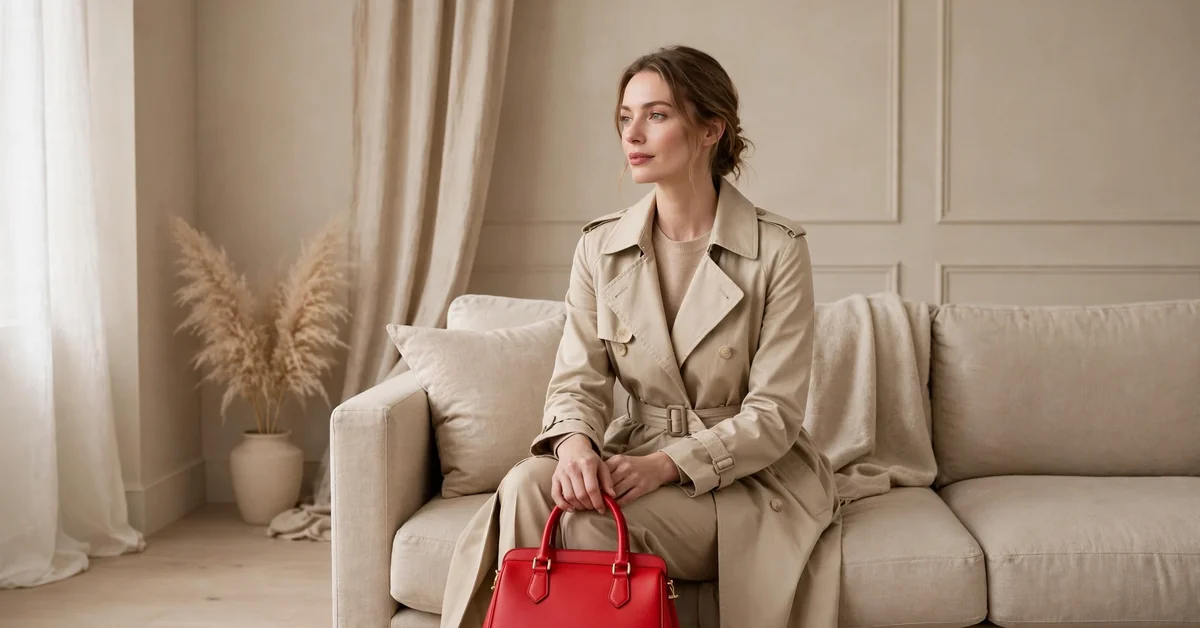
This is not about size at all. Imagine a photo that is 90% soft beige and 10% bright red. What do you see? Only red. That is color proportion. Pros use the 60-30-10 rule. 60% dominant color, 30% secondary, 10% accent. Get this right and your proportion images pop without extra editing.
5. Negative Space Proportion
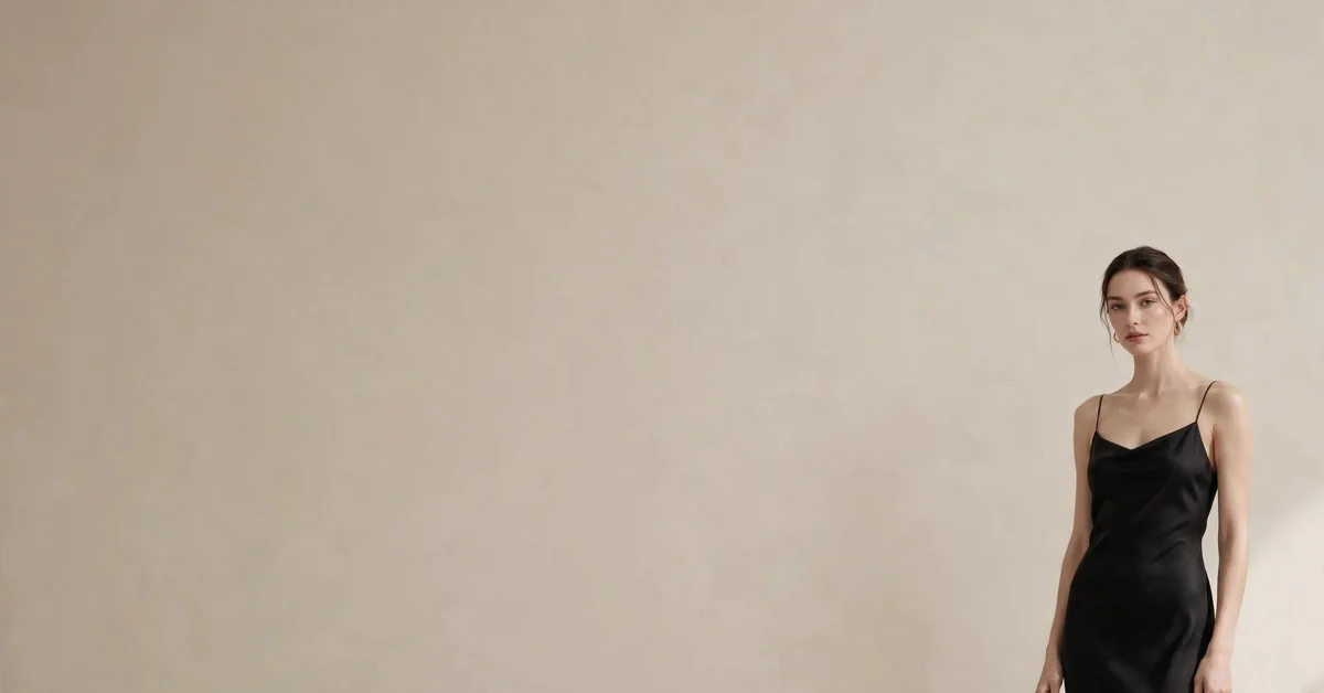
How much empty space you leave. This is what separates a budget brand from a luxury brand. A budget brand’s proportion photo might have 90% model and 10% background – feels crowded and cheap. A luxury brand’s proportion photo might have 30% model and 70% empty space – feels expensive and calm. That empty space proportion is a pricing signal.
Golden Ratio in Composition – The Math Behind Beautiful Photos
Let’s finally talk about golden ratio in composition, because everyone mentions it but few explain how to actually use it.
The golden ratio is 1 to 1.618. It is also called divine proportion. You see it in shells, flower petals, and faces we find attractive. Our brains love this ratio without knowing why.
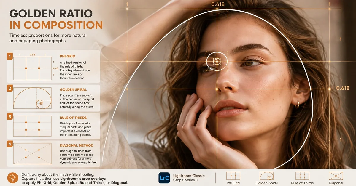
Photographers turned this math into practical tools you can use in Lightroom:
The Phi Grid
It looks like rule of thirds, but better. Rule of thirds divides your frame into 3 equal parts. Phi grid divides it into 1, 0.618, 1. So the middle column is smaller. Place your subject on those inner lines and your proportion in photography instantly feels more natural and less static than rule of thirds.
The Golden Spiral – Also Called Fibonacci Spiral
Picture a small snail shell starting in the corner of your photo and spiraling out. You put your main subject at the tightest part of the spiral, and let the rest of the scene follow the curve outward. Perfect for leading lines – a road curving through mountains, or a model’s arm leading to her face. When you use the spiral, viewers stay longer on your photo.
Rule of Thirds
The beginner version that still works. Divide your frame into 9 equal boxes with two vertical and two horizontal lines. Put interesting things where the lines cross. Simple and effective for any proportion photo.
Diagonal Method
Great for architecture and dynamic poses. You use diagonal lines from corner to corner to place your subject. Adds energy and movement.
My practical advice: Don’t try to calculate math while shooting. Shoot first. Then when you crop in Lightroom, you can use the crop overlay to see golden ratio, spiral, thirds, diagonal.
Photo Composition Framing and Aspect Ratios
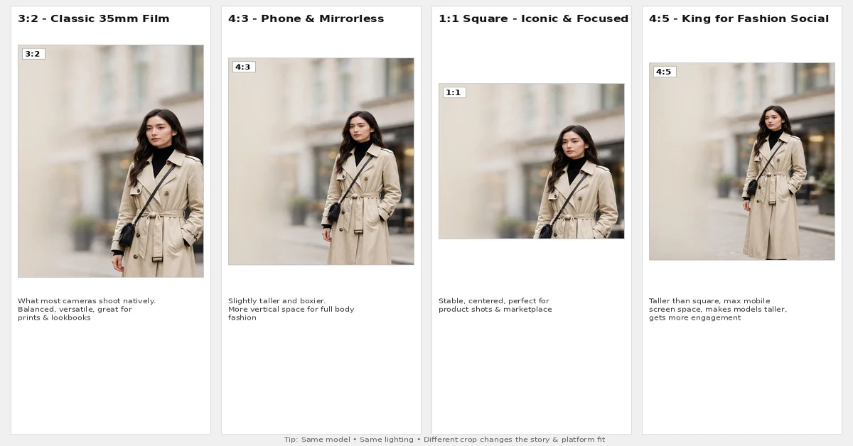
Photo composition framing and proportion are inseparable. Change the frame, you change the story.
3:2 – What most cameras shoot natively. Comes from old 35mm film. Classic, balanced, versatile. Great for prints and lookbooks.
4:3 – What many phones and mirrorless cameras shoot. Slightly taller and boxier. Fantastic for fashion because it gives more vertical space for full body shots.
1:1 Square – The moment you go square, everything changes. A square proportion photo feels stable, iconic, and focused. Forces you to center your subject. Perfect for product shots and main marketplace images where you need clean symmetry.
4:5 – This is the king for fashion on social media and product pages. It is taller than square and takes up maximum screen space on mobile without getting cropped. It makes models look taller naturally and gets more engagement than square. If you sell fashion online, this should be your default for social.
16:9 Wide – Cinematic and dramatic. Use it for website banners and hero sections.
What this means in practice: Photograph a person in portrait orientation and their proportions look natural and flattering. Photograph the same person in landscape and they can look squashed. Some proportion pictures work better vertical, some horizontal. The subject should decide, not habit.
Pro tip: Always shoot a little wider than you need. You can crop to 1:1 or 4:5 later, but you can never add back feet you cut off while shooting.
How to Use Proportion in Photography – 12 Techniques That Actually Work
These are from real shoots, not theory from books.
1. Move Your Feet Before You Zoom
Don’t just stand in one place and zoom in and out. Walk. Move left, move right, get low on the ground, get high on a stool. A low angle makes legs look longer – every top fashion photographer uses this for proportional photos of models. A high angle makes subjects look small and sweet. Your camera angle is your most powerful proportion tool.
2. Change Your Focal Length With Purpose
50mm is how human eyes see. Natural. 85mm to 100mm is how we want to be seen – flattering, compresses the face nicely without making the nose big. That is why 85mm is called the portrait lens. 35mm and wider exaggerates – makes whatever is close look huge. Great for interiors, terrible for close portraits. 200mm compresses distance and makes background look super close. To understand this better, learn how focal length changes how proportion looks.
3. Add a Human Element for Scale
Want to show how big a location is? Don’t just shoot the location. Put a person in color at the bottom. Instantly everyone understands scale. That is why travel photos of proportion always have a person.
4. Play Foreground Against Background
Put a small flower very close to your lens and a huge mountain far away. Now the flower becomes the hero. Swap them – make flower far and mountain close – now mountain is hero. That foreground to background proportion is how you control story.
5. Fix Your Horizon Line
This is the fastest fix. Never put your horizon dead center unless you have a perfect mirror reflection. Put it one third from the top if you want to show beautiful foreground, or one third from the bottom if you have a dramatic sky. That one third shift fixes your proportion photo instantly.
6. Use Triangles for Groups
Don’t line up 3 models like a police lineup. Make a triangle. One slightly forward, two slightly back. Or one sitting, two standing. Triangular proportion pictures feel cohesive and professional.
7. Use Close Cropping to Change Meaning
Modern cameras have huge resolution. Use it. A tight crop on hands showing rings tells a different story than a full body shot. Close cropping is proportion control in editing for product detail pages.
8. Control Color Proportion
If everything in your photo is colorful, nothing stands out. Make 80% of your image muted – beige, gray, white – and let 20% pop with bright color. That color proportion will guide the eye faster than any size trick.
9. Respect Negative Space
Don’t fill every corner. The empty space you leave is as important as what you fill. For luxury proportion pictures, 70% empty space and 30% subject feels expensive. For catalog, 50-50 feels clean and efficient.
10. Watch Your Edges
Wide angle lenses stretch things at the edges. If you shoot group photos at 24mm, the people on the edges will look wider. Keep important subjects away from extreme corners.
11. Think About Distance, Not Just Zoom
Moving forward makes your foreground subject bigger and more important. Moving backward makes everything feel more equal. If you want to emphasize a product, get physically closer.
12. Shoot Vertical for People
Sounds too simple, but most beginners get it wrong. People are vertical. Shoot them vertical. You get more natural body proportion and you fill the frame better for mobile, where most shopping happens now.
Proportion in Fashion Photography – Where Brands Win or Lose
If you sell fashion, this section is worth real money. In fashion, you juggle three proportions at once: body proportion, garment proportion, and frame proportion. Get one wrong and you get returns.
Body Proportion: A model is 5’11” in real life. Shot from a low angle with a wide lens, she can look 6’2″ with super long legs. Great for editorial where you sell fantasy. Terrible for e-commerce where customer expects true length. For online stores, you need standard proportion that is true to life.
Garment Proportion: A dress is 42 inches long. Your photo should make it look 42 inches, not 45. If shooting angle makes it look longer, customers return it saying length issue. Many brands see 20-25% returns just because of wrong garment proportion in photos.
Frame Proportion: Best brands have a template. Model occupies 60% of vertical height, 15% headroom on top, 25% space below feet. That proportion picture template makes the whole site look consistent. When you scroll a good site, nothing jumps.
How to shoot fashion with correct proportion:
- Use 85mm to 100mm lens for full body to avoid distortion
- Keep camera at chest height, not low, for e-commerce
- Keep distance at least 8 to 10 feet from model
- Use 4:5 aspect ratio for social and product pages
- Always include a straight on full length shot for true proportion reference
Even if you shoot perfectly, you will still need to fix proportion slightly in post-production. Every top brand does this during fashion photo editing to get that clean, balanced look
Proportion in Other Genres
Portrait Photography: Keep it natural. Don’t shoot too close. Keep hands on same plane as face, otherwise one hand looks giant. Use 85mm lens. That is the classic portrait proportion photo lens.
Landscape Photography: To show grandeur, you must have a reference. A small cabin, a tree, a person. Without it, huge mountain looks like small hill in proportion images.
Architecture Photography: Here proportion must be accurate. Buildings should not lean. Walls must be vertical. Use Transform tool to fix. Clients pay for accurate proportion.
Product and E-commerce: This is all about standard proportion. Your proportion photo must match real product measurements exactly. No creative stretching. Trust depends on it.
Street Photography: Street is chaotic. To control proportion, use 50mm lens which sees like human eye, and wait for moments where subjects align naturally into balanced layers.
Photos of Proportion
Image of Proportion 1 – Forced Perspective: A person appears to hold a building between thumb and finger. Funny, but pure altered proportion. Building far, hand close.
Proportion Picture 2 – Scale Story: Tiny boat under massive iceberg. Boat tiny, iceberg huge. That proportion creates awe and tells a story instantly.
Proportional Photos 3 – Fashion Trick: Model shot from low angle at 35mm, legs look extra long. Great for editorial, bad for catalog. Same model shot at eye level with 85mm looks natural and trustworthy.
Proportion Images 4 – Color Proportion: Group of models all in beige with one in bright red dress. Eye goes straight to red. That is 90-10 color proportion.
Proportion Photo 5 – Luxury Space: Single model in huge empty white studio. 80% empty, 20% model. That empty space proportion feels premium.
Proportion Pictures 6 – Detail vs Full: Tight crop of embroidery detail next to full dress shot on product page. You show both micro and macro proportion together.
When you save these proportion images for reference, name them properly: proportional-photography-fashion-4by5-example.jpg – helps SEO and keeps you organized.
Common Mistakes That Ruin Your Proportion Photo
- Shooting a group at 24mm up close – people on edges look stretched.
- Cutting off feet or hands in fashion shots – kills garment proportion.
- Putting horizon in the middle – makes photo static, 50-50 split never works.
- Using same crop for all platforms – your 3:2 website banner cropped to 1:1 for social will cut heads.
- Making everything sharp and bright – when everything is important, nothing is important.
- Ignoring background proportion – messy background taking 50% of frame competes with subject.
- Not following marketplace fill rules – main images need 85% product fill on white.
How to Fix Proportion in Post-Production
You can fix most proportion issues after shooting. This is not cheating, it is professional workflow.
In Lightroom: Use Crop Overlay, press O for golden spiral, fix horizon, use Lens Correction to remove wide angle distortion.
In Photoshop: Use Transform > Warp to fix dress hem that is uneven, use Puppet Warp to subtly adjust body proportion, use Content Aware Scale to change background proportion without stretching model.
Doing this for 1000 images by hand is not realistic. That is why even big studios outsource to editing teams who specialize in keeping proportional photos consistent.
Tools and Quick Checklist
Tools:
- Camera Grid: Turn on 3×3 and golden ratio grid
- Lightroom: Crop tool overlays
- Photoshop: Lens Correction, Transform, Puppet Warp
- Phone: Use 2x lens for portraits – roughly 50mm and gives natural proportion
Checklist Before You Click:
- Is main subject on golden ratio or thirds intersection?
- Is horizon at one third, not half?
- Am I at right height? Chest height for e-commerce, low for editorial?
- Is lens distorting? Too close with wide lens?
- What is taking up 60% of frame? Is that what I want to sell?
- Did I leave breathing room around feet and head?
- What is my color proportion? Clear dominant?
FAQs
Q1. What is proportion in photography in simple words?
Proportion in photography is how sizes and positions of things inside your photo relate to each other to make image feel balanced and natural.
Q2. What is the difference between proportional photography and scale?
Scale shows real world size using a known object. Proportion is internal relationship of sizes inside your frame.
Q3. What are good photos of proportion examples?
Good examples are person under mountain for scale, tight detail crop vs full shot, or fashion model shot with 70% empty space for luxury feel.
Q4. What is golden ratio in composition and should I use it?
Golden ratio is 1:1.618, a natural ratio found in nature that looks beautiful. Yes, use phi grid or golden spiral overlay when cropping to get more pleasing proportion images.
Q5. What is a good proportion picture for fashion e-commerce?
Good proportion picture has model taking 60% of vertical space, 15% headroom, 25% foot space, shot at chest height with 85mm lens, in 4:5 ratio.
Q6. How do you fix proportion photo in editing?
Use Lightroom lens correction and crop with golden ratio overlay. For fashion, use professional retouching to fix garment reshaping and body proportion subtly.
Q7. What is image of proportion vs proportion images?
Both mean images showing good proportional relationships. Use image of proportion for single hero and proportion images for gallery.
Q8. What is photo composition framing?
Photo composition framing is choosing your aspect ratio and how you place subjects inside that frame to control proportion and story.
Final Takeaway
Proportion in photography is not a boring rule from art school. It is the invisible feeling that makes someone stop, stare, and trust your photo.
You don’t need to master all 5 types tomorrow. Start with one. Tomorrow, just fix your camera angle. Next shoot, fix your focal length. Small steps, big results.
And if you are a brand with hundreds of images where proportion went slightly wrong, don’t reshoot. Fix it smartly.
If you want, send me 2 of your current proportion pictures and I will tell you exactly what to fix.