
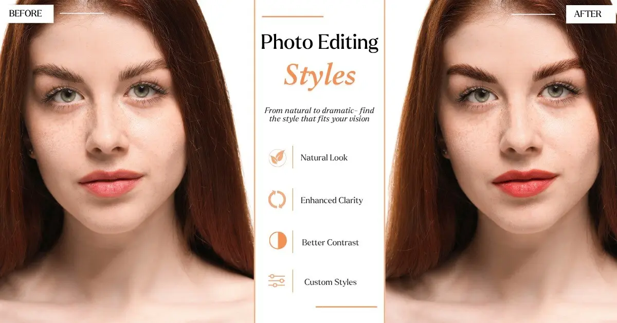
Key Takeaways: Different photo editing styles change mood, not just color – from clean and natural to black and white, portra 400 film wedding light leak to natural hdr interior real estate. Always show true photo editing before after, not mirror, and pick style by niche while keeping edits natural.
Here is an important truth that is rarely discussed when you are starting out.
You can learn every Lightroom slider. You can watch 200 YouTube tutorials. And your portfolio can still look inconsistent, as if each photo was edited in a different mood.
I went through the same phase for almost a year.
Two photographers can literally stand next to each other, shoot the same person in the same park at the same time, and their final photos look nothing alike. One feels bright and dreamy. The other feels dark and like a movie. Same light, same model. Different photo editing style.
That’s the whole game right now. Your style is your brand. It’s how people know it’s you before they see your name.
So in this guide I’m going to break down all the different photo editing styles that actually matter. Not just names. What they look like, when to use them, and how I actually get the look in Lightroom. No fluff.
If you are looking for creative inspiration, check out these
photography editing ideas
Table of Contents
What is a photo editing style?
It is not just a preset. Many beginners think style is the same as a preset they purchased.
Correction is about fixing technical issues. Photo too dark, white balance is yellow, horizon is crooked. You fix it. Everyone does that, that’s just basic.
Style is what you do AFTER it’s fixed. Do you want it warm and nostalgic? Do you want it clean and expensive looking? Do you want it dark and moody like a Netflix poster? Do you lift your blacks so it looks like old film? Do you pull the green out so it feels earthy and fall-ish?
That’s style. Think of it like handwriting. We all write ABCs, but my handwriting looks like mine and yours looks like yours. Your photo editing style is your visual handwriting. It’s how you handle tone curve, how you handle color, how you handle skin, grain, all that, over and over.
Once you get that, you stop guessing. You start editing with intention. And suddenly your feed looks pro. That’s the shift.
Why your editing style matters more than sharpness
I see beginners obsessing over sharpness. Clients? They don’t care. Not even a little. They care about how it FEELS.
First, you become recognizable. When someone is scrolling and stops and goes “oh that’s definitely her work” without even seeing your name, you have a brand. That’s what a consistent photography editing style does. It’s free marketing and you don’t have to try.
Second, you control emotion. This is real. Soft light pastel tones feel romantic and safe and happy. Deep shadows and muted tones feel emotional, maybe a little sad, mysterious. High contrast vibrant color feels loud and powerful. You’re telling people how to feel before they even look at the subject.
Third, clients search by style. In fact, clients actively search for terms like “light and airy wedding photographer” or “dark and moody elopement” or “clean natural headshot editing”. If you don’t have a clear photo editing style on your website and you don’t use those words, you are invisible. Google doesn’t know what to show.
And fourth, you will edit so much faster. Once you build your own preset for your favorite types of picture editing, you can sync a whole wedding in 20 minutes. Without a style? You’re editing one by one for 10 hours. I learned that the hard way.
5 Core Elements That Define All Editing Styles in Photography
Honestly every single picture editing style you see on Instagram is just a different recipe using these 5 ingredients. Master these and you can copy any look.
1. Exposure and Light. Are you a bright person or a dark person? Light and airy people live at Exposure +0.3 to +0.7, Shadows +50, Blacks +15. Everything open. Moody people live at Exposure -0.3, Blacks -20. Decide.
Learn
how to increase exposure in Photoshop.
2. Tone Curve and Contrast. This is the most powerful tool and most people never touch it. Want that faded matte look everyone loves? Go to Tone Curve in Lightroom and drag the bottom-left point up to around 15. Boom. Pure black is now dark gray. Want punchy magazine look? Make a hard S shape. Lift highlights a bit, crush shadows a bit. This one thing is like 50% of any style.
3. Color. This is the heart of styles of photo editing. White balance first – warm feels nostalgic, cool feels cinematic. Then HSL. If you shift green hue towards yellow and pull green saturation down, you get that earthy expensive outdoor look everyone wants. If you shift blue hue towards teal, you get cinematic. Then Color Grading panel – teal in shadows, orange in highlights is literally the movie poster look.
4. Grain and Texture and Clarity. Grain 30 amount, size 25 = film. Clarity -15 = dreamy, soft, romantic. Texture +20 and Clarity +15 = gritty, edgy. But don’t just add grain to everything. It needs a reason.
5. Skin Tone Protection. This is what separates pro photo editing styles from amateur filters. You can do whatever crazy thing you want to the background but skin HAS to look human. In Lightroom, Orange = skin. Red = skin. If you mess with orange too much people look gray or sunburned. Always check orange luminance last. If skin looks dead, bring orange saturation back up +10 and luminance +10. This step makes a big difference.
Okay enough theory. Let’s get to the actual list.
25+ Different Photo Editing Styles
Classic and Timeless Photo Editing Styles
1. Clean and Natural Photo Editing Style
This is the “no edit” edit. Which is actually the hardest edit. Colors look real, white balance is spot on, light is balanced. It looks like what your eye saw.
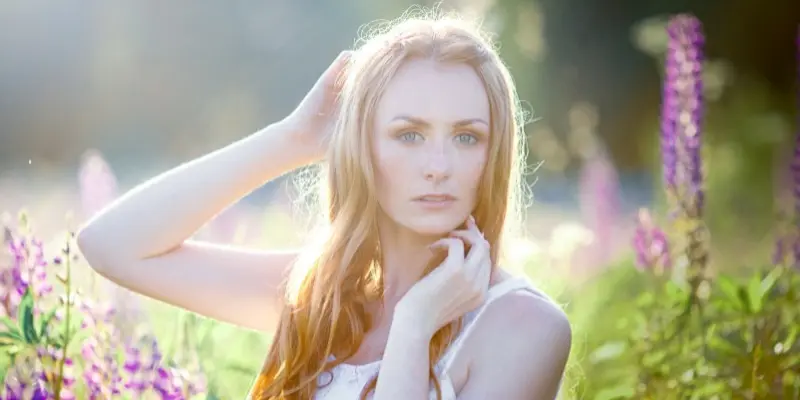
Good for headshots, newborn, product, real estate, anything where you need timeless.
How I do it – Vibrance like +10, Saturation 0, Lens Corrections on, Sharpening 60 with Masking 70. No lifted blacks, no grain, no vignette.
White balance with eyedropper on something gray. Simple but hard to get perfect.
2. Black and White
Please don’t just desaturate. Real black and white photography is about mixing colors to gray. You control how bright each color turns.
Amazing for street, weddings when color is messy, emotional portraits.
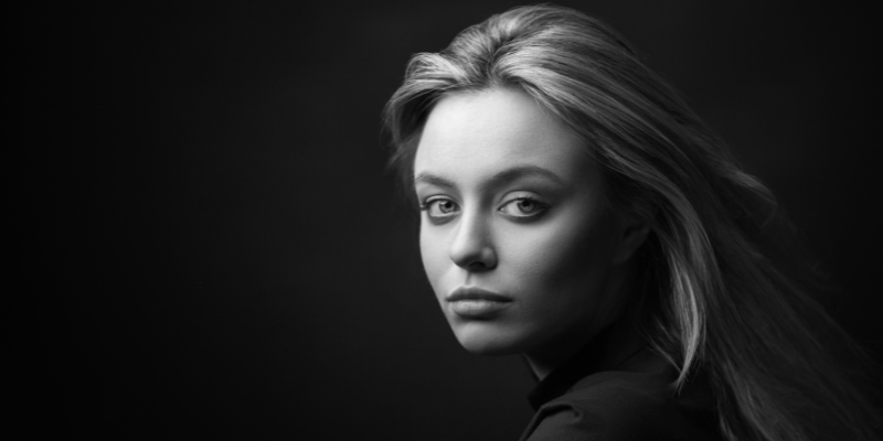
In Lightroom go to B&W Mix. I usually do Red +20, Orange +25, Yellow +10 – that makes skin glow and bright. Then Green +10, Blue -40 for dramatic sky. That’s mid-contrast. Want more punch? Pull Blacks -30, Whites +30.
Want warm B&W? Go to Color Grading, Highlights Hue 40 Sat 8-10 for that soft sepia warmth. Still one of the best kinds of photo editing ever.
3. Vintage and Retro
70s family album. Warm, faded, a little grainy, maybe a little light leak in the corner like sun hit the film. Nostalgic.
I love this for lifestyle, travel, family.
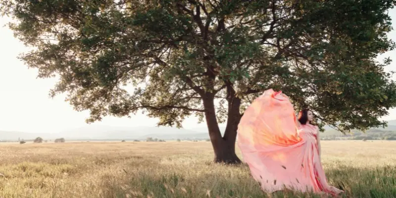
Contrast -15, Blacks +20, Temperature +12, Grain 40. In Tone Curve lift blacks to 12-15. Pull green saturation down -20. Sometimes I add a light leak overlay on Screen mode 15% opacity. But careful, too much yellow and people look jaundiced. Check skin.
4. Film Emulation
This is more polished than vintage. You’re copying real film emulation stocks. Portra 400 is warm, soft, pastel highlights, insanely good skin. Fuji 400H is cooler, greens more minty, amazing for outdoors. Gold is punchy and warm.
Best for weddings, editorial, lifestyle storytelling. Honestly the most loved photography editing style for weddings right now.
How – Use a good film preset as base, then Highlights -30 so they roll off soft not clipped. Shadows +10 with slight warm tint. Fine grain like 25. And slightly overexpose skin +0.3. Film is about highlight roll-off, not just grain. That’s what most people get wrong.
5. High Contrast / Editorial
Magazine cover. Deep blacks, bright whites, colors pop, everything crisp. Skin is retouched but still has texture, not plastic.
Fashion, beauty, sports, commercial – if you want to stand out, this is it.
Contrast +40, Whites +25, Blacks -30, Vibrance +20, Clarity +10. S-curve in Tone Curve. Sharpen but mask it like 80 so background doesn’t get crunchy. Don’t crush shadows to pure black though, keep a little detail in hair.
6. Matte Effect
You know those soft faded Instagram feeds? Pure black doesn’t exist, it’s dark gray. Very calm, modern.
Casual portraits, landscapes, apparel brands love it.
It’s literally one move – Tone Curve bottom left point up to 15-25. Then Contrast -10, Blacks +10. Saturation -8. Done. But don’t add high contrast with it, those fight each other.
7. HDR – Natural HDR
Old HDR was crunchy and fake and horrible. New HDR is invisible. You see detail in bright windows AND dark shadows, no halos.
Landscape, architecture, interiors, real estate.
Shadows +70, Highlights -70, Dehaze +10, Texture +10. Or merge 3 brackets in Lightroom HDR. If people can tell it’s HDR, you went too far. If you see glow around trees, pull Dehaze back.
Light and Bright Picture Editing Styles
8. Light and Airy
Bright, soft, romantic, glowy skin. Exposure high, shadows open, whites clean, colors pastel but not fake. The most popular wedding style for over a decade.
Weddings, newborn, motherhood, boho portraits.
Exposure +0.5, Shadows +55, Blacks +18, Whites +15, Contrast -12. Temperature +5 warm. Orange Luminance +12 for that glow. Slightly desaturate green -15. And please shoot a little overexposed to begin with, your files will be cleaner. Biggest mistake? Blowing out skin. Glowy is not blown out. Check histogram.
9. Pastel and Dreamy
Like light and airy but softer, more feminine. Pinks, creams, soft blues. Very hazy.
Baby, spring, influencer, beauty.
Take light and airy base then Clarity -15, Dehaze -5, Texture -5. HSL Green Sat -20, Yellow Sat -15, Blue Lum +15. Add radial filter with soft glow. But keep eyes sharp, always sharpen eyes separately or it looks blurry.
10. Minimalist and Clean
Less is more. Neutral colors, lots of empty space, no distractions. The photo breathes. The edit is invisible, composition is star.
Product, branding, architecture, modern portraits.
Perfect white balance, balanced exposure, remove everything distracting with healing. No grain, no vignette. This is one of the most underrated styles of photography editing for commercial work and honestly it’s more about shooting than editing.
Dark, Moody and Cinematic Styles of Photography Editing
11. Dark and Moody
Rich shadows, deep contrast, muted earthy tones, desaturated greens, emotional. Feels like fall, feels like Pacific Northwest.
Elopements, adventure couples, food, lifestyle.
Exposure -0.3, Shadows -25, Blacks -25, Contrast +12, Whites -10. HSL Green Sat -30, Green Hue +15 towards yellow, Orange Sat -10. Color Grading Shadows Hue 30 Sat 8 for warm moody. And here’s my trick – add radial filter on face +0.3 exposure so subject doesn’t disappear in shadows. Biggest mistake? The zombie edit – turning grass gray and skin green. Don’t desaturate green -100, -25 to -30 max.
12. Light and Moody
Okay so everyone says they want dark and moody but they actually want this. Highlights stay brighter, colors pop a bit more, but shadows are deeper than light and airy. Deep and earthy without being heavy. Super bookable.
13. Cinematic / Teal and Orange
Straight out of Hollywood. Cool teal shadows, warm orange skin and highlights. Huge separation.
Travel, adventure, automotive, wedding films.
Color Grading Shadows Hue 200 Sat 18, Highlights Hue 38 Sat 16. HSL Blue Hue +15 towards teal, Orange Sat +10. Slightly crush blacks Tone Curve bottom left up 5. But careful, if skin turns orange pull Orange Sat back to +5. This is one of the leading styles for travel photography right now. for travel right now.
14. Fine Art
Looks like a painting you’d hang in a gallery. Soft light, creamy tones, refined pastels or muted jewel tones. High-end, expensive.
High-end weddings, bridal, ballet.
Low contrast, lifted shadows, Texture -12, Clarity -5. Skin retouching is dodged and burned by hand not blurred. Light is everything, shoot with big window light. Mistake is over-softening skin to plastic. Fine art keeps texture, just evens tone.
15. Desaturated and Muted
Not black and white but color pulled way back. Sophisticated, calm, editorial, expensive feeling like Aritzia. Very popular with brands.
Editorial, lifestyle, urban, menswear.
Vibrance -25, Saturation -10, HSL pull all colors down -15 except orange/red. Keep contrast low. Don’t make it dead though, keep just enough color to know what color it was.
Creative and Artistic Picture Editing Styles
16. Cross-Processed
Mimics developing film in wrong chemicals. Wild color shifts, skies pink, shadows green, skin warm. Bold.
Street, music, fashion.
Tone Curve channel by channel – Red channel lift shadows, Blue channel S-curve. Experiment until you get the look you want. Use for 1-2 hero shots not whole gallery, it’s strong.
17. Damaged Film / Expired
Grainy, scratched, dusty, light leaks, color bleeds, like you found a roll in attic.
Grunge, urban, album covers.
Heavy grain 70, film dust texture Overlay 20%, scratches, light leak Screen 15%, random color shifts.
18. Double Exposure
Two images blended – portrait + landscape, portrait + flowers. Symbolic, story inside a person.
Conceptual, branding, mental health.
Photoshop – portrait layer on top of landscape, blend mode Screen, black mask paint white where you want blend. One image should be simple silhouette, one detailed or it gets messy.
19. Surreal / Composite
Fantasy worlds that don’t exist. Floating islands, giant moon. The only limit is your imagination.
Digital art, advertising.
Advanced Photoshop, match light direction, shadows, color grade each layer with Camera Raw filter, add haze for atmosphere. One of the most impressive different photo editing styles but takes hours.
20. Selective Color and Pop Art
One color pops rest B&W. Or bold comic dots, high contrast primary colors.
Commercial, social ads.
HSL desaturate all -100 except one, or masking. For pop art high contrast high sat add halftone pattern. Use sparingly, dates fast. Please don’t do selective color on weddings.
21. Golden Hour Glow
Warm glowy honey light even if you shot at 2pm. Soft golden highlights, warm shadows, glowing skin, sun flare.
Portraits, engagements, travel.
Temp +20, Tint +5, Highlights Hue 45 Sat 18 in Color Grading, Shadows Hue 35 Sat 10. Add radial filter with warm temp +20 exposure +0.3 where sun should be, Dehaze -10 inside it for glow. Add magenta +5 tint to balance yellow.
22. Neon Glow / Cyberpunk
Pink and blue city lights, futuristic, Blade Runner.
Night portraits, urban fashion.
HSL Blue Hue -20 towards magenta, Purple Sat +40, Blue Sat +20. Highlights +20, Shadows +20, Dehaze -5. Grain 20. Noisy shadows are problem so use noise reduction.
23. Motion Blur
Intentional blur to show movement, energy.
Dance, sports, street, concerts.
Photoshop Path Blur or slow shutter 1/15 in camera. Keep eyes or face relatively sharp, blur rest.
24. Film Noir
Old crime movie. Hard directional light, deep shadows, high contrast B&W, smoke, mystery.
Cinematic male portraits, editorial.
One hard light 45 degrees to side, B&W, Blacks -40, Whites +30, Contrast +30, heavy vignette -50, subtle smoke overlay.
25. Bokeh / Playful Lights
Blurry lights are hero. Dreamy circles.
Christmas, night weddings, proposals.
Shoot 85mm f/1.4-2.0 close to subject far background with lights. Highlights +20 to make bokeh pop, Clarity -5.
26. Collage
Multiple photos, textures, film borders, tape, handwritten text.
Memory boards, mood boards.
Canva or Photoshop artboards.
How to Choose the Right Photography Editing Style for Your Work
Don’t pick what’s trending on TikTok this week.
Wedding/Elopement – light and airy, film, fine art, cinematic, golden hour glow. Romantic, flattering.
Family/Newborn – clean natural, pastel dreamy, bright and airy. True skin.
Portrait/Fashion – high contrast, matte, B&W, golden hour, bokeh.
Landscape/Travel – natural HDR, cinematic, vintage, golden hour.
Street/Documentary – B&W, desaturated muted, film noir, clean natural.
Product/Brand – minimalist clean, natural true-to-life.
Creative – surreal, double exposure, neon glow, cross-processed.
Ask – What feeling? Joy = bright. Drama = dark moody. Power = high contrast. Calm = muted matte.
Where will it live? Feed = cohesive. Gallery wall = fine art. Store = clean.
Does skin look human? Non-negotiable.
How I built my own style
Week 1- I just saved 50 photos I loved. Not just photographers – movies, album covers, magazines. What did they have in common? For me it was warm shadows, lifted blacks, muted greens.
Week 2- I took one shoot, 20 photos, edited it 5 ways. Clean, matte film, dark moody, light and airy, cinematic. Looked at all 20 together as grid. Which grid felt most me? Which would I be proud to post for 6 months straight?
Week 3- I saved it as preset. 3 versions – 50%, 75%, 100% strength. Then tested on 10 different skin tones in sun and shade and indoor. Dark skin looked ashy at first, had to fix orange/red HSL. Skin test is everything honestly.
Week 4- I forced myself to use ONLY that preset family for 20 shoots. Tweaked exposure and white balance per image but kept tone curve and HSL consistent. After 6 months people started recognizing my work. That’s when you know.
Name your preset something personal not “My Preset 1”. Mine is “Honey Matte”. Feels like yours.
Final word
There’s no best photo editing style. Only the style that feels effortless to you, flatters your subjects, and you can do consistently when you’re tired at 11pm editing a wedding.
So try them. All 25 types of picture editing above. Run same 5 photos through all these different editing styles. The one that makes you go “yeah that’s me” – that’s your starting point. Refine it till someone can spot your work without logo.
That’s when you stop searching for styles of photography editing and start owning one.